Mapping in Python#
Co-author
Prerequisites
Outcomes
Use geopandas to create maps
# Uncomment following line to install on colab
#! pip install fiona geopandas xgboost gensim folium pyLDAvis descartes
import geopandas as gpd
import matplotlib.pyplot as plt
import pandas as pd

from shapely.geometry import Point

%matplotlib inline
Mapping in Python#
In this lecture, we will use a new package, geopandas, to create maps.
Maps are really quite complicated… We are trying to project a spherical surface onto a flat figure, which is an inherently complicated endeavor.
Luckily, geopandas will do most of the heavy lifting for us.
Let’s start with a DataFrame that has the latitude and longitude coordinates of various South American cities.
Our goal is to turn them into something we can plot – in this case, a GeoDataFrame.
df = pd.DataFrame({
    'City': ['Buenos Aires', 'Brasilia', 'Santiago', 'Bogota', 'Caracas'],
    'Country': ['Argentina', 'Brazil', 'Chile', 'Colombia', 'Venezuela'],
    'Latitude': [-34.58, -15.78, -33.45, 4.60, 10.48],
    'Longitude': [-58.66, -47.91, -70.66, -74.08, -66.86]
})
In order to map the cities, we need tuples of coordinates.
We generate them by zipping the latitude and longitude together to store them in a new column named Coordinates.
df["Coordinates"] = list(zip(df.Longitude, df.Latitude))
df.head()
| City | Country | Latitude | Longitude | Coordinates | |
|---|---|---|---|---|---|
| 0 | Buenos Aires | Argentina | -34.58 | -58.66 | (-58.66, -34.58) |
| 1 | Brasilia | Brazil | -15.78 | -47.91 | (-47.91, -15.78) |
| 2 | Santiago | Chile | -33.45 | -70.66 | (-70.66, -33.45) |
| 3 | Bogota | Colombia | 4.60 | -74.08 | (-74.08, 4.6) |
| 4 | Caracas | Venezuela | 10.48 | -66.86 | (-66.86, 10.48) |
Our next step is to turn the tuple into a Shapely Point object.
We will do this by applying Shapely’s Point method to the Coordinates column.
df["Coordinates"] = df["Coordinates"].apply(Point)
df.head()
| City | Country | Latitude | Longitude | Coordinates | |
|---|---|---|---|---|---|
| 0 | Buenos Aires | Argentina | -34.58 | -58.66 | POINT (-58.66 -34.58) |
| 1 | Brasilia | Brazil | -15.78 | -47.91 | POINT (-47.91 -15.78) |
| 2 | Santiago | Chile | -33.45 | -70.66 | POINT (-70.66 -33.45) |
| 3 | Bogota | Colombia | 4.60 | -74.08 | POINT (-74.08 4.6) |
| 4 | Caracas | Venezuela | 10.48 | -66.86 | POINT (-66.86 10.48) |
Finally, we will convert our DataFrame into a GeoDataFrame by calling the geopandas.DataFrame method.
Conveniently, a GeoDataFrame is a data structure with the convenience of a normal DataFrame but also an understanding of how to plot maps.
In the code below, we must specify the column that contains the geometry data.
See this excerpt from the docs
The most important property of a GeoDataFrame is that it always has one GeoSeries column that holds a special status. This GeoSeries is referred to as the GeoDataFrame’s “geometry”. When a spatial method is applied to a GeoDataFrame (or a spatial attribute like area is called), this commands will always act on the “geometry” column.
gdf = gpd.GeoDataFrame(df, geometry="Coordinates")
gdf.head()
| City | Country | Latitude | Longitude | Coordinates | |
|---|---|---|---|---|---|
| 0 | Buenos Aires | Argentina | -34.58 | -58.66 | POINT (-58.66 -34.58) |
| 1 | Brasilia | Brazil | -15.78 | -47.91 | POINT (-47.91 -15.78) |
| 2 | Santiago | Chile | -33.45 | -70.66 | POINT (-70.66 -33.45) |
| 3 | Bogota | Colombia | 4.60 | -74.08 | POINT (-74.08 4.6) |
| 4 | Caracas | Venezuela | 10.48 | -66.86 | POINT (-66.86 10.48) |
# Doesn't look different than a vanilla DataFrame...let's make sure we have what we want
print('gdf is of type:', type(gdf))

# And how can we tell which column is the geometry column?
print('\nThe geometry column is:', gdf.geometry.name)
gdf is of type: <class 'geopandas.geodataframe.GeoDataFrame'>

The geometry column is: Coordinates
Plotting a Map#
Great, now we have our points in the GeoDataFrame.
Let’s plot the locations on a map.
This will require 3 steps
Get the map
Plot the map
Plot the points (our cities) on the map
1. Get the map#
An organization called Natural Earth compiled the map data that we use here.
The file provides the outlines of countries, over which we’ll plot the city locations from our GeoDataFrame.
Luckily, Natural Earth has already done the hard work of creating these files, and we can pull them directly from their website.
# Grab low resolution world file from NACIS
url = "https://naciscdn.org/naturalearth/110m/cultural/ne_110m_admin_0_countries.zip"
world = gpd.read_file(url)[['SOV_A3', 'POP_EST', 'CONTINENT', 'NAME', 'GDP_MD', 'geometry']]
world = world.set_index("SOV_A3")
print(world.columns)
world.head()
Index(['POP_EST', 'CONTINENT', 'NAME', 'GDP_MD', 'geometry'], dtype='object')
| POP_EST | CONTINENT | NAME | GDP_MD | geometry | |
|---|---|---|---|---|---|
| SOV_A3 | |||||
| FJI | 889953.0 | Oceania | Fiji | 5496 | MULTIPOLYGON (((180 -16.06713, 180 -16.55522, ... |
| TZA | 58005463.0 | Africa | Tanzania | 63177 | POLYGON ((33.90371 -0.95, 34.07262 -1.05982, 3... |
| SAH | 603253.0 | Africa | W. Sahara | 907 | POLYGON ((-8.66559 27.65643, -8.66512 27.58948... |
| CAN | 37589262.0 | North America | Canada | 1736425 | MULTIPOLYGON (((-122.84 49, -122.97421 49.0025... |
| US1 | 328239523.0 | North America | United States of America | 21433226 | MULTIPOLYGON (((-122.84 49, -120 49, -117.0312... |
world is a GeoDataFrame with the following columns:
POP_EST: Contains a population estimate for the countryCONTINENT: The country’s continentNAME: The country’s nameSOV_A3: The country’s 3 letter abbreviation (we made this the index)GDP_MD: The most recent estimate of country’s GDPgeometry: APOLYGONfor each country (we will learn more about these soon)
world.geometry.name
'geometry'
Notice that the geometry for this GeoDataFrame is stored in the geometry column.
A quick note about polygons
Instead of points (as our cities are), the geometry objects are now polygons.
A polygon is what you already likely think it is – a collection of ordered points connected by straight lines.
The smaller the distance between the points, the more readily the polygon can approximate non-linear shapes.
Let’s see an example of a polygon.
world.loc["ALB", 'geometry']

Notice that it displayed the country of Albania.
# Returns two arrays that hold the x and y coordinates of the points that define the polygon's exterior.
x, y = world.loc["ALB", "geometry"].exterior.coords.xy

# How many points?
print('Points in the exterior of Albania:', len(x))
Points in the exterior of Albania: 24
Let’s see another
world.loc["AFG", "geometry"]

# Returns two arrays that hold the x and y coordinates of the points that define the polygon's exterior.
x, y = world.loc["AFG", 'geometry'].exterior.coords.xy

# How many points?
print('Points in the exterior of Afghanistan:', len(x))
Points in the exterior of Afghanistan: 69
Notice that we’ve now displayed Afghanistan.
This is a more complex shape than Albania and thus required more points.
2. Plotting the map#
fig, gax = plt.subplots(figsize=(10,10))

# By only plotting rows in which the continent is 'South America' we only plot SA.
world.query("CONTINENT == 'South America'").plot(ax=gax, edgecolor='black',color='white')

# By the way, if you haven't read the book 'longitude' by Dava Sobel, you should...
gax.set_xlabel('longitude')
gax.set_ylabel('latitude')

gax.spines['top'].set_visible(False)
gax.spines['right'].set_visible(False)

plt.show()
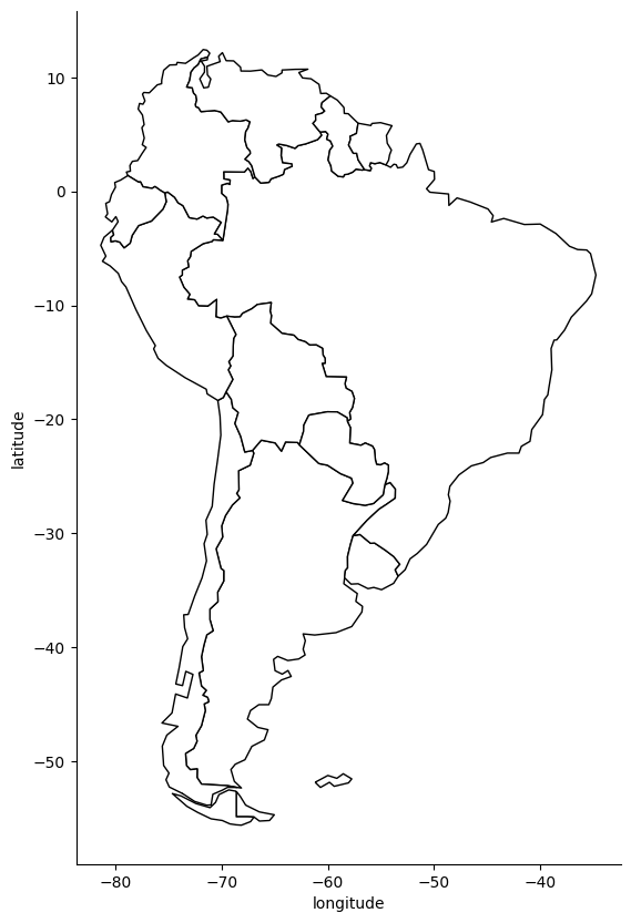
Creating this map may have been easier than you expected!
In reality, a lot of heavy lifting is going on behind the scenes.
Entire university classes (and even majors!) focus on the theory and thought
that goes into creating maps, but, for now, we are happy to rely on the work done by the
experts behind geopandas and its related libraries.
3. Plot the cities#
In the code below, we run the same commands as before to plot the South American countries, but
, now, we also plot the data in gdf, which contains the location of South American cities.
# Step 3: Plot the cities onto the map
# We mostly use the code from before --- we still want the country borders plotted --- and we
# add a command to plot the cities
fig, gax = plt.subplots(figsize=(10,10))

# By only plotting rows in which the continent is 'South America' we only plot, well,
# South America.
world.query("CONTINENT == 'South America'").plot(ax = gax, edgecolor='black', color='white')

# This plot the cities. It's the same syntax, but we are plotting from a different GeoDataFrame.
# I want the cities as pale red dots.
gdf.plot(ax=gax, color='red', alpha = 0.5)

gax.set_xlabel('longitude')
gax.set_ylabel('latitude')
gax.set_title('South America')

gax.spines['top'].set_visible(False)
gax.spines['right'].set_visible(False)

plt.show()
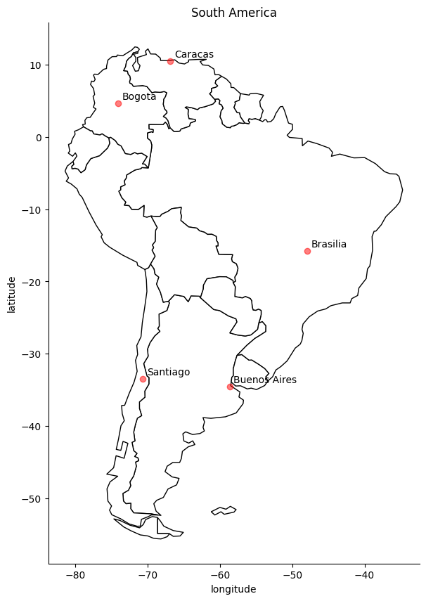
Adding labels to points.
Finally, we might want to consider annotating the cities so we know which cities are which.
# Step 3: Plot the cities onto the map
# We mostly use the code from before --- we still want the country borders plotted --- and we add a command to plot the cities
fig, gax = plt.subplots(figsize=(10,10))

# By only plotting rows in which the continent is 'South America' we only plot, well, South America.
world.query("CONTINENT == 'South America'").plot(ax = gax, edgecolor='black', color='white')

# This plot the cities. It's the same syntax, but we are plotting from a different GeoDataFrame. I want the
# cities as pale red dots.
gdf.plot(ax=gax, color='red', alpha = 0.5)

gax.set_xlabel('longitude')
gax.set_ylabel('latitude')
gax.set_title('South America')

# Kill the spines...
gax.spines['top'].set_visible(False)
gax.spines['right'].set_visible(False)

# ...or get rid of all the axis. Is it important to know the lat and long?
# plt.axis('off')


# Label the cities
for x, y, label in zip(gdf['Coordinates'].x, gdf['Coordinates'].y, gdf['City']):
    gax.annotate(label, xy=(x,y), xytext=(4,4), textcoords='offset points')

plt.show()
Case Study: Voting in Wisconsin#
In the example that follows, we will demonstrate how each county in Wisconsin voted during the 2016 Presidential Election.
Along the way, we will learn a couple of valuable lessons:
Where to find shape files for US states and counties
How to match census style data to shape files
Find and Plot State Border#
Our first step will be to find the border for the state of interest. This can be found on the US Census’s website here.
You can download the cb_2016_us_state_5m.zip by hand, or simply allow geopandas to extract
the relevant information from the zip file online.
state_df = gpd.read_file("https://datascience.quantecon.org/assets/data/cb_2016_us_state_5m.zip")
state_df.head()
| STATEFP | STATENS | AFFGEOID | GEOID | STUSPS | NAME | LSAD | ALAND | AWATER | geometry | |
|---|---|---|---|---|---|---|---|---|---|---|
| 0 | 01 | 01779775 | 0400000US01 | 01 | AL | Alabama | 00 | 131173688951 | 4593686489 | MULTIPOLYGON (((-88.04374 30.51742, -88.03661 ... |
| 1 | 02 | 01785533 | 0400000US02 | 02 | AK | Alaska | 00 | 1477946266785 | 245390495931 | MULTIPOLYGON (((-133.65582 55.62562, -133.6249... |
| 2 | 04 | 01779777 | 0400000US04 | 04 | AZ | Arizona | 00 | 294198560125 | 1027346486 | POLYGON ((-114.79968 32.59362, -114.80939 32.6... |
| 3 | 08 | 01779779 | 0400000US08 | 08 | CO | Colorado | 00 | 268429343790 | 1175112870 | POLYGON ((-109.06025 38.59933, -109.05954 38.7... |
| 4 | 09 | 01779780 | 0400000US09 | 09 | CT | Connecticut | 00 | 12542638347 | 1815476291 | POLYGON ((-73.72778 41.1007, -73.69595 41.1154... |
print(state_df.columns)
Index(['STATEFP', 'STATENS', 'AFFGEOID', 'GEOID', 'STUSPS', 'NAME', 'LSAD',
       'ALAND', 'AWATER', 'geometry'],
      dtype='object')
We have various columns, but, most importantly, we can find the right geometry by filtering by name.
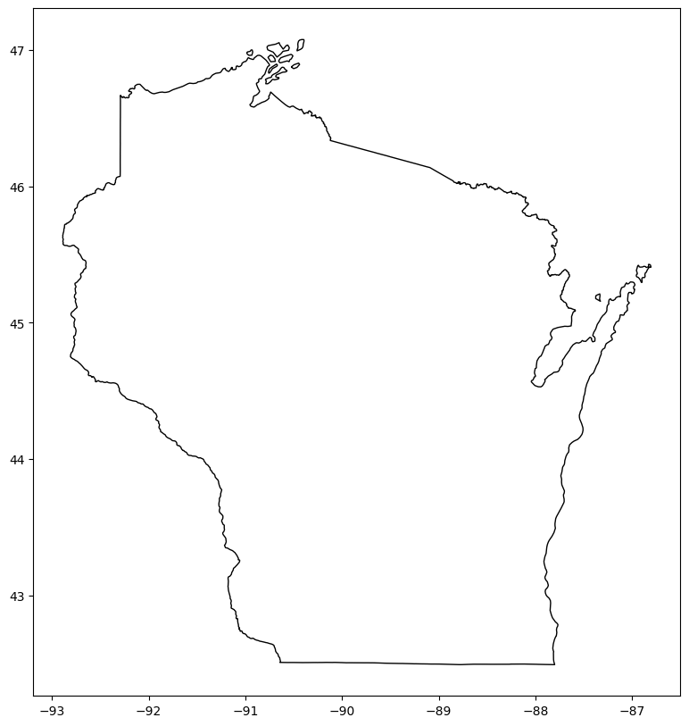
fig, gax = plt.subplots(figsize=(10, 10))
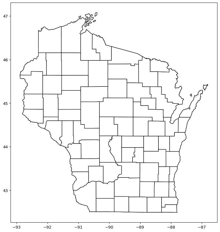
state_df.query("NAME == 'Wisconsin'").plot(ax=gax, edgecolor="black", color="white")
plt.show()
Find and Plot County Borders#
Next, we will add the county borders to our map.
The county shape files (for the entire US) can be found on the Census site.
Once again, we will use the 5m resolution.
county_df = gpd.read_file("https://datascience.quantecon.org/assets/data/cb_2016_us_county_5m.zip")
county_df.head()
| STATEFP | COUNTYFP | COUNTYNS | AFFGEOID | GEOID | NAME | LSAD | ALAND | AWATER | geometry | |
|---|---|---|---|---|---|---|---|---|---|---|
| 0 | 04 | 015 | 00025445 | 0500000US04015 | 04015 | Mohave | 06 | 34475567011 | 387344307 | POLYGON ((-114.75562 36.08717, -114.75364 36.0... |
| 1 | 12 | 035 | 00308547 | 0500000US12035 | 12035 | Flagler | 06 | 1257365642 | 221047161 | POLYGON ((-81.52366 29.62243, -81.32406 29.625... |
| 2 | 20 | 129 | 00485135 | 0500000US20129 | 20129 | Morton | 06 | 1889993251 | 507796 | POLYGON ((-102.04195 37.02474, -102.04195 37.0... |
| 3 | 28 | 093 | 00695770 | 0500000US28093 | 28093 | Marshall | 06 | 1828989833 | 9195190 | POLYGON ((-89.72432 34.99521, -89.64428 34.995... |
| 4 | 29 | 510 | 00767557 | 0500000US29510 | 29510 | St. Louis | 25 | 160458044 | 10670040 | POLYGON ((-90.31821 38.60002, -90.30183 38.655... |
print(county_df.columns)
Index(['STATEFP', 'COUNTYFP', 'COUNTYNS', 'AFFGEOID', 'GEOID', 'NAME', 'LSAD',
       'ALAND', 'AWATER', 'geometry'],
      dtype='object')
Wisconsin’s FIPS code is 55 so we will make sure that we only keep those counties.
county_df = county_df.query("STATEFP == '55'")
Now we can plot all counties in Wisconsin.
fig, gax = plt.subplots(figsize=(10, 10))

state_df.query("NAME == 'Wisconsin'").plot(ax=gax, edgecolor="black", color="white")
county_df.plot(ax=gax, edgecolor="black", color="white")

plt.show()
Get Vote Data#
The final step is to get the vote data, which can be found online on this site.
Our friend Kim says,
Go ahead and open up the file. It’s a mess! I saved a cleaned up version of the file to
results.csvwhich we can use to save the hassle with cleaning the data. For fun, you should load the raw data and try beating it into shape. That’s what you normally would have to do… and it’s fun.
We’d like to add that such an exercise is also “good for you” (similar to how vegetables are good for you).
But, for the example in class, we’ll simply start with his cleaned data.
results = pd.read_csv("https://datascience.quantecon.org/assets/data/ruhl_cleaned_results.csv", thousands=",")
results.head()
| county | total | trump | clinton | |
|---|---|---|---|---|
| 0 | ADAMS | 10130 | 5966 | 3745 |
| 1 | ASHLAND | 8032 | 3303 | 4226 |
| 2 | BARRON | 22671 | 13614 | 7889 |
| 3 | BAYFIELD | 9612 | 4124 | 4953 |
| 4 | BROWN | 129011 | 67210 | 53382 |
Notice that this is NOT a GeoDataFrame; it has no geographical information.
But it does have the names of each county.
We will be able to use this to match to the counties from county_df.
First, we need to finish up the data cleaning.
results["county"] = results["county"].str.title()
results["county"] = results["county"].str.strip()
county_df["NAME"] = county_df["NAME"].str.title()
county_df["NAME"] = county_df["NAME"].str.strip()
Then, we can merge election results with the county data.
res_w_states = county_df.merge(results, left_on="NAME", right_on="county", how="inner")
Next, we’ll create a new variable called trump_share, which will denote the percentage of votes that
Donald Trump won during the election.
res_w_states["trump_share"] = res_w_states["trump"] / (res_w_states["total"])
res_w_states["rel_trump_share"] = res_w_states["trump"] / (res_w_states["trump"]+res_w_states["clinton"])
res_w_states.head()
| STATEFP | COUNTYFP | COUNTYNS | AFFGEOID | GEOID | NAME | LSAD | ALAND | AWATER | geometry | county | total | trump | clinton | trump_share | rel_trump_share | |
|---|---|---|---|---|---|---|---|---|---|---|---|---|---|---|---|---|
| 0 | 55 | 035 | 01581077 | 0500000US55035 | 55035 | Eau Claire | 06 | 1652211310 | 18848512 | POLYGON ((-91.65046 44.85595, -90.92225 44.857... | Eau Claire | 55025 | 23331 | 27340 | 0.424007 | 0.460441 |
| 1 | 55 | 113 | 01581116 | 0500000US55113 | 55113 | Sawyer | 06 | 3256410077 | 240690443 | POLYGON ((-91.55128 46.15704, -91.23838 46.157... | Sawyer | 9137 | 5185 | 3503 | 0.567473 | 0.596800 |
| 2 | 55 | 101 | 01581111 | 0500000US55101 | 55101 | Racine | 06 | 861267826 | 1190381762 | POLYGON ((-88.30638 42.8421, -88.06992 42.8433... | Racine | 94302 | 46681 | 42641 | 0.495016 | 0.522615 |
| 3 | 55 | 097 | 01581109 | 0500000US55097 | 55097 | Portage | 06 | 2074100548 | 56938133 | POLYGON ((-89.84493 44.68494, -89.34592 44.681... | Portage | 38589 | 17305 | 18529 | 0.448444 | 0.482921 |
| 4 | 55 | 135 | 01581127 | 0500000US55135 | 55135 | Waupaca | 06 | 1936525696 | 45266211 | POLYGON ((-89.22374 44.68136, -88.60516 44.678... | Waupaca | 26095 | 16209 | 8451 | 0.621153 | 0.657299 |
Finally, we can create our map.
fig, gax = plt.subplots(figsize = (10,8))

# Plot the state
state_df[state_df['NAME'] == 'Wisconsin'].plot(ax = gax, edgecolor='black',color='white')

# Plot the counties and pass 'rel_trump_share' as the data to color
res_w_states.plot(
    ax=gax, edgecolor='black', column='rel_trump_share', legend=True, cmap='RdBu_r',
    vmin=0.2, vmax=0.8
)

# Add text to let people know what we are plotting
gax.annotate('Republican vote share',xy=(0.76, 0.06),  xycoords='figure fraction')

# I don't want the axis with long and lat
plt.axis('off')

plt.show()
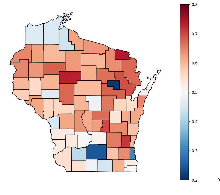
What do you see from this map?
How many counties did Trump win? How many did Clinton win?
res_w_states.eval("trump > clinton").sum()
60
res_w_states.eval("clinton > trump").sum()
12
Who had more votes? Do you think a comparison in counties won or votes won is more reasonable? Why do you think they diverge?
res_w_states["trump"].sum()
1405284
res_w_states["clinton"].sum()
1382536
What story could you tell about this divergence?
Interactivity#
Multiple Python libraries can help create interactive figures.
Here, we will see an example using bokeh.
In the another lecture, we will see an example with folium.
from bokeh.io import output_notebook
from bokeh.plotting import figure, ColumnDataSource
from bokeh.io import output_notebook, show, output_file
from bokeh.plotting import figure
from bokeh.models import GeoJSONDataSource, LinearColorMapper, ColorBar, HoverTool
from bokeh.palettes import brewer
output_notebook()
import json
res_w_states["clinton_share"] = res_w_states["clinton"] / res_w_states["total"]
#Convert data to geojson for bokeh
wi_geojson=GeoJSONDataSource(geojson=res_w_states.to_json())
color_mapper = LinearColorMapper(palette = brewer['RdBu'][10], low = 0, high = 1)
color_bar = ColorBar(color_mapper=color_mapper, label_standoff=8,width = 500, height = 20,
                     border_line_color=None,location = (0,0), orientation = 'horizontal')
hover = HoverTool(tooltips = [ ('County','@county'),('Portion Trump', '@trump_share'),
                               ('Portion Clinton','@clinton_share'),
                               ('Total','@total')])
p = figure(title="Wisconsin Voting in 2016 Presidential Election", tools=[hover])
p.patches("xs","ys",source=wi_geojson,
          fill_color = {'field' :'rel_trump_share', 'transform' : color_mapper})
p.add_layout(color_bar, 'below')
show(p)