Plotting#
Prerequisites
Outcomes
Understand components of matplotlib plots
Make basic plots
# Uncomment following line to install on colab
#! pip install
Visualization#
One of the most important outputs of your analysis will be the visualizations that you choose to communicate what you’ve discovered.
Here are what some people – whom we think have earned the right to an opinion on this material – have said with respect to data visualizations.
I spend hours thinking about how to get the story across in my visualizations. I don’t mind taking that long because it’s that five minutes of presenting it or someone getting it that can make or break a deal – Goldman Sachs executive
We won’t have time to cover “how to make a compelling data visualization” in this lecture.
Instead, we will focus on the basics of creating visualizations in Python.
This will be a fast introduction, but this material appears in almost every lecture going forward, which will help the concepts sink in.
In almost any profession that you pursue, much of what you do involves communicating ideas to others.
Data visualization can help you communicate these ideas effectively, and we encourage you to learn more about what makes a useful visualization.
We include some references that we have found useful below.
matplotlib#
The most widely used plotting package in Python is matplotlib.
The standard import alias is
import matplotlib.pyplot as plt
import numpy as np
Note above that we are using matplotlib.pyplot rather than just matplotlib.
pyplot is a sub-module found in some large packages to further organize functions and types. We are able to give the plt alias to this sub-module.
Additionally, when we are working in the notebook, we need tell matplotlib to display our images inside of the notebook itself instead of creating new windows with the image.
This is done by
%matplotlib inline
The commands with % before them are called Magics.
First Plot#
Let’s create our first plot!
After creating it, we will walk through the steps one-by-one to understand what they do.
# Step 1
fig, ax = plt.subplots()

# Step 2
x = np.linspace(0, 2*np.pi, 100)
y = np.sin(x)

# Step 3
ax.plot(x, y)
[<matplotlib.lines.Line2D at 0x7fd1382cb830>]
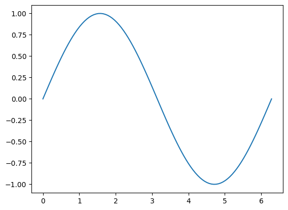
Create a figure and axis object which stores the information from our graph.
Generate data that we will plot.
Use the
xandydata, and make a line plot on our axis,ax, by calling theplotmethod.
Difference between Figure and Axis#
We’ve found that the easiest way for us to distinguish between the figure and axis objects is to think about them as a framed painting.
The axis is the canvas; it is where we “draw” our plots.
The figure is the entire framed painting (which inclues the axis itself!).
We can also see this by setting certain elements of the figure to different colors.
fig, ax = plt.subplots()

fig.set_facecolor("red")
ax.set_facecolor("blue")
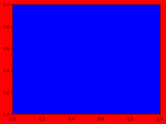
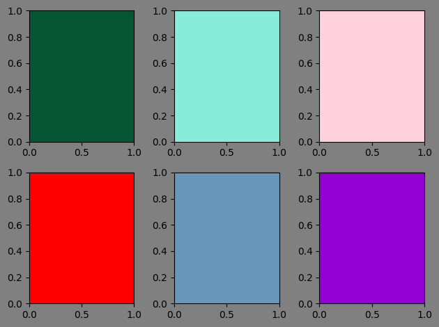
This difference also means that you can place more than one axis on a figure.
# We specified the shape of the axes -- It means we will have two rows and three columns
# of axes on our figure
fig, axes = plt.subplots(2, 3)

fig.set_facecolor("gray")

# Can choose hex colors
colors = ["#065535", "#89ecda", "#ffd1dc", "#ff0000", "#6897bb", "#9400d3"]

# axes is a numpy array and we want to iterate over a flat version of it
for (ax, c) in zip(axes.flat, colors):
    ax.set_facecolor(c)

fig.tight_layout()
Functionality#
The matplotlib library is versatile and very flexible.
You can see various examples of what it can do on the matplotlib example gallery.
We work though a few examples to quickly introduce some possibilities.
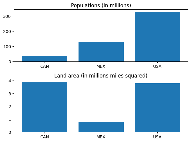
Bar
countries = ["CAN", "MEX", "USA"]
populations = [36.7, 129.2, 325.700]
land_area = [3.850, 0.761, 3.790]

fig, ax = plt.subplots(2)

ax[0].bar(countries, populations, align="center")
ax[0].set_title("Populations (in millions)")

ax[1].bar(countries, land_area, align="center")
ax[1].set_title("Land area (in millions miles squared)")

fig.tight_layout()
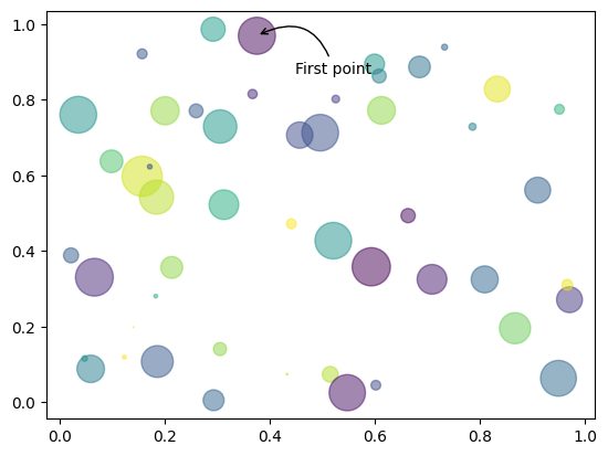
Scatter and annotation
N = 50

np.random.seed(42)

x = np.random.rand(N)
y = np.random.rand(N)
colors = np.random.rand(N)
area = np.pi * (15 * np.random.rand(N))**2  # 0 to 15 point radii

fig, ax = plt.subplots()

ax.scatter(x, y, s=area, c=colors, alpha=0.5)

ax.annotate(
    "First point", xy=(x[0], y[0]), xycoords="data",
    xytext=(25, -25), textcoords="offset points",
    arrowprops=dict(arrowstyle="->", connectionstyle="arc3,rad=0.6")
)
Text(25, -25, 'First point')
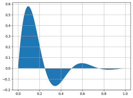
Fill between
x = np.linspace(0, 1, 500)
y = np.sin(4 * np.pi * x) * np.exp(-5 * x)

fig, ax = plt.subplots()

ax.grid(True)
ax.fill(x, y)
[<matplotlib.patches.Polygon at 0x7fd1381e2cf0>]