Case Study: Recidivism#
Co-authors
Prerequisites
Outcomes
See an end-to-end data science exercise
Application of regression
# Uncomment following line to install on colab
#! pip install fiona geopandas xgboost gensim folium pyLDAvis descartes
import matplotlib.pyplot as plt
import numpy as np
import pandas as pd
import seaborn as sns

from sklearn import (
    linear_model, metrics, neural_network, pipeline, preprocessing, model_selection
)

%matplotlib inline
Introduction to Recidivism#
Recidivism is the tendency for an individual who has previously committed a crime to commit another crime in the future.
One key input to a judge’s sentencing decision is how likely a given convict is to re-offend, or recidivate.
In an effort to assist the legal system with sentencing guidelines, data scientists have attempted to predict an individual’s risk of recidivism from known observables.
Some are concerned that this process may exhibit prejudice, either through biased inputs or through statistical discrimination.
For example,
Biased inputs: Imagine that a judge often writes harsher sentences to people of a particular race or gender. If an algorithm is trained to reproduce the sentences of this judge, the bias will be propagated by the algorithm.
Statistical discrimination: Imagine that two variables (say race and income) are correlated, and one of them (say income) is correlated with the risk of recidivism. If income is unobserved, then an otherwise unbiased method would discriminate based on race, even if race has nothing to say about recidivism after controlling for income.
This has given rise to serious discussions about the moral obligations data scientists have to those who are affected by their tools.
We will not take a stance today on our moral obligations, but we believe this is an important precursor to any statistical work with public policy applications.
One predictive tool used by various courts in the United States is called COMPAS (Correctional Offender Management Profiling for Alternative Sanctions).
We will be following a Pro Publica article that analyzes the output of COMPAS.
The findings of the article include:
Black defendants were often predicted to be at a higher risk of recidivism than they actually were.
White defendants were often predicted to be less risky than they were.
Black defendants were twice as likely as white defendants to be misclassified as being a higher risk of violent recidivism.
Even when controlling for prior crimes, future recidivism, age, and gender, black defendants were 77 percent more likely to be assigned higher risk scores than white defendants.
Data Description#
The authors of this article filed a public records request with the Broward County Sheriff’s office in Florida.
Luckily for us, they did a significant amount of the legwork which is described in this methodology article.
We download the data below.
data_url = "https://raw.githubusercontent.com/propublica/compas-analysis"
data_url += "/master/compas-scores-two-years.csv"

df = pd.read_csv(data_url)
df.head()
| id | name | first | last | compas_screening_date | sex | dob | age | age_cat | race | ... | v_decile_score | v_score_text | v_screening_date | in_custody | out_custody | priors_count.1 | start | end | event | two_year_recid | |
|---|---|---|---|---|---|---|---|---|---|---|---|---|---|---|---|---|---|---|---|---|---|
| 0 | 1 | miguel hernandez | miguel | hernandez | 2013-08-14 | Male | 1947-04-18 | 69 | Greater than 45 | Other | ... | 1 | Low | 2013-08-14 | 2014-07-07 | 2014-07-14 | 0 | 0 | 327 | 0 | 0 |
| 1 | 3 | kevon dixon | kevon | dixon | 2013-01-27 | Male | 1982-01-22 | 34 | 25 - 45 | African-American | ... | 1 | Low | 2013-01-27 | 2013-01-26 | 2013-02-05 | 0 | 9 | 159 | 1 | 1 |
| 2 | 4 | ed philo | ed | philo | 2013-04-14 | Male | 1991-05-14 | 24 | Less than 25 | African-American | ... | 3 | Low | 2013-04-14 | 2013-06-16 | 2013-06-16 | 4 | 0 | 63 | 0 | 1 |
| 3 | 5 | marcu brown | marcu | brown | 2013-01-13 | Male | 1993-01-21 | 23 | Less than 25 | African-American | ... | 6 | Medium | 2013-01-13 | NaN | NaN | 1 | 0 | 1174 | 0 | 0 |
| 4 | 6 | bouthy pierrelouis | bouthy | pierrelouis | 2013-03-26 | Male | 1973-01-22 | 43 | 25 - 45 | Other | ... | 1 | Low | 2013-03-26 | NaN | NaN | 2 | 0 | 1102 | 0 | 0 |
5 rows × 53 columns
We summarize some of the variables that we will use.
first: An individual’s first namelast: An individual’s last namesex: An individual’s sexage: An individual’s agerace: An individual’s race. It takes values of Caucasian, Hispanic, African-American, Native American, Asian, or Otherpriors_count: Number of previous arrestsdecile_score: The COMPAS risk scoretwo_year_recid: Whether the individual had been jailed for a new crime in next two years
Descriptive Statistics#
The first thing we do with our data is to drop any classes without “enough” observations.
One of our focuses will be on inter-race differences in scores and recidivism, so we only keep data on races with at least 500 observations in our data set.
Just be aware that this kind of seemingly and even genuinely benign or “technical” decision can still perpetuate inequality by exclusion.
For example, Asians are a small minority, so they’re not really present in the data, and therefore they’re absent from the policy discussion — we have no inferential knowledge on how COMPAS scores work for them.
race_count = df.groupby(["race"])["name"].count()
at_least_500 = list(race_count[race_count > 500].index)
print("The following race have at least 500 observations:", at_least_500)
df = df.loc[df["race"].isin(at_least_500), :]
The following race have at least 500 observations: ['African-American', 'Caucasian', 'Hispanic']
Next, we explore the remaining data using plots and tables.
Age, Sex, and Race#
Let’s look at how the dataset is broken down into age, sex, and race.
def create_groupcount_barplot(df, group_col, figsize, **kwargs):
    "call df.groupby(group_col), then count number of records and plot"
    counts = df.groupby(group_col,observed=True)["name"].count().sort_index()

    fig, ax = plt.subplots(figsize=figsize)
    counts.plot(kind="bar", **kwargs)

    ax.spines["right"].set_visible(False)
    ax.spines["top"].set_visible(False)
    ax.set_xlabel("")
    ax.set_ylabel("")

    return fig, ax
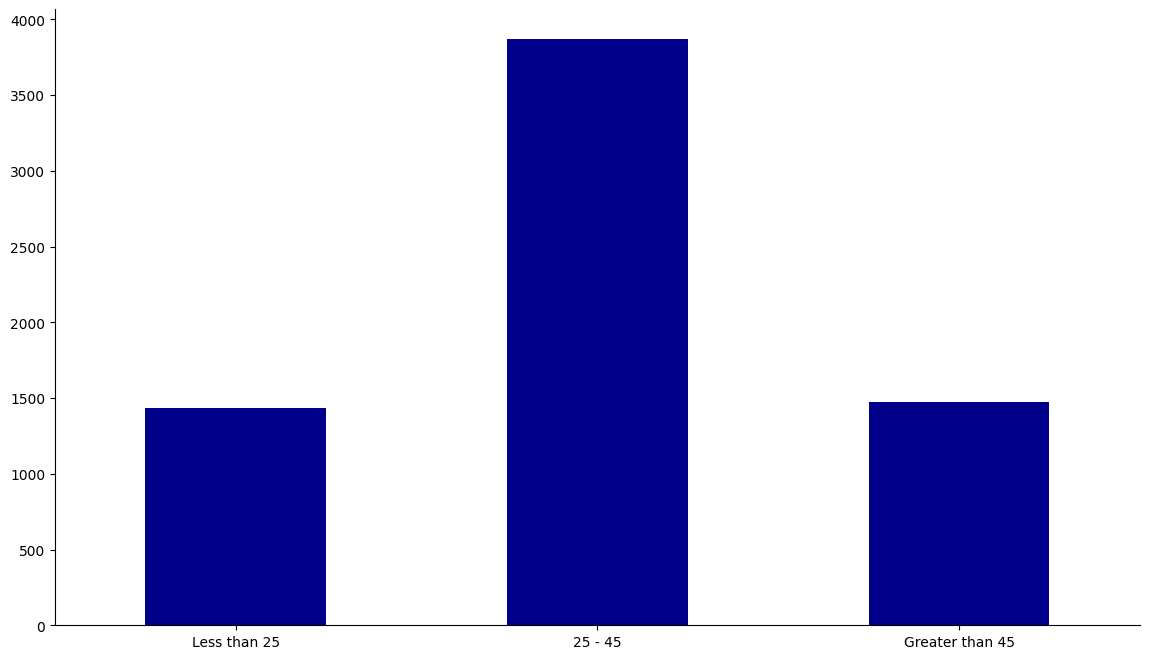
age_cs = ["Less than 25", "25 - 45", "Greater than 45"]
df["age_cat"] = pd.Categorical(df["age_cat"], categories=age_cs, ordered=True)
fig, ax = create_groupcount_barplot(df, "age_cat", (14, 8), color="DarkBlue", rot=0)
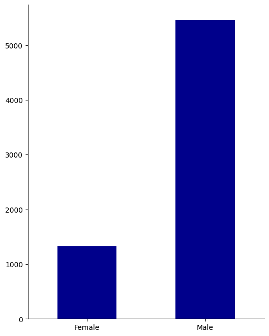
sex_cs = ["Female", "Male"]
df["sex"] = pd.Categorical(df["sex"], categories=sex_cs, ordered=True)
create_groupcount_barplot(df, "sex", (6, 8), color="DarkBlue", rot=0)
(<Figure size 600x800 with 1 Axes>, <Axes: >)
race_cs = ["African-American", "Caucasian", "Hispanic"]
df["race"] = pd.Categorical(df["race"], categories=race_cs, ordered=True)
create_groupcount_barplot(df, "race", (12, 8), color="DarkBlue", rot=0)
(<Figure size 1200x800 with 1 Axes>, <Axes: >)
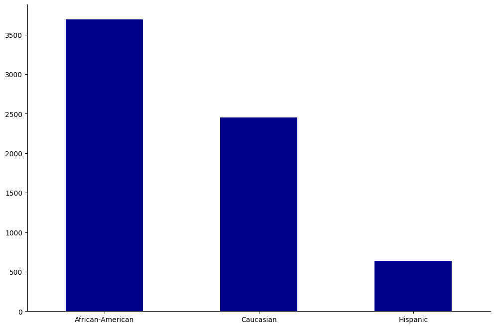
From this, we learn that our population is mostly between 25-45, male, and is mostly African-American or Caucasian.
Recidivism#
We now look into how recidivism is split across groups.
recid = df.groupby(["age_cat", "sex", "race"], observed=True)["two_year_recid"].mean().unstack(level="race")
recid
| race | African-American | Caucasian | Hispanic | |
|---|---|---|---|---|
| age_cat | sex | |||
| Less than 25 | Female | 0.449704 | 0.310345 | 0.411765 |
| Male | 0.645806 | 0.541254 | 0.536364 | |
| 25 - 45 | Female | 0.382278 | 0.423948 | 0.333333 |
| Male | 0.533074 | 0.433699 | 0.375000 | |
| Greater than 45 | Female | 0.227273 | 0.239766 | 0.217391 |
| Male | 0.425101 | 0.289157 | 0.216667 |
In the table, we see that the young have higher recidivism rates than the old, except for among Caucasian females.
Also, African-American males are at a particularly high risk of recidivism even as they get older.
Risk Scores#
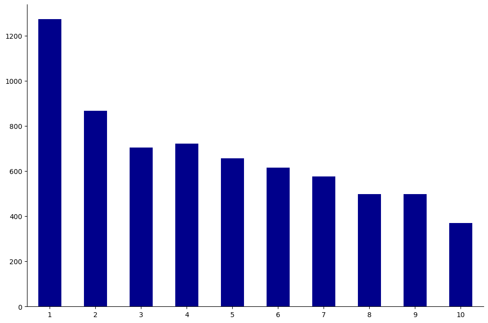
Each individual in the dataset was assigned a decile_score ranging from 1 to 10.
This score represents the perceived risk of recidivism with 1 being the lowest risk and 10 being the highest.
We show a bar plot of all decile scores below.
create_groupcount_barplot(df, "decile_score", (12, 8), color="DarkBlue", rot=0)
(<Figure size 1200x800 with 1 Axes>, <Axes: >)
How do these scores differ by race?
dfgb = df.groupby("race", observed=True)
race_count = df.groupby("race", observed=True)["name"].count()

fig, ax = plt.subplots(3, figsize=(14, 8))

for (i, race) in enumerate(["African-American", "Caucasian", "Hispanic"]):
    (
        (dfgb
            .get_group(race)
            .groupby("decile_score")["name"].count() / race_count[race]
        )
        .plot(kind="bar", ax=ax[i], color="#353535")
    )
    ax[i].set_ylabel(race)
    ax[i].set_xlabel("")
    # set equal y limit for visual comparison
    ax[i].set_ylim(0, 0.32)

fig.suptitle("Score Frequency by Race")
Text(0.5, 0.98, 'Score Frequency by Race')
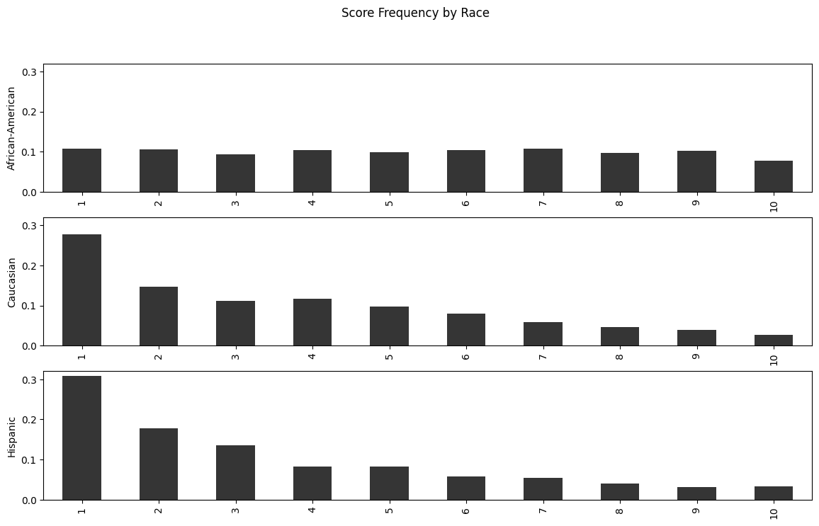
While Caucasians and Hispanics both see the majority of their score distribution on low values, African-Americans are almost equally likely to receive any score.
Risk Scores and Recidivism#
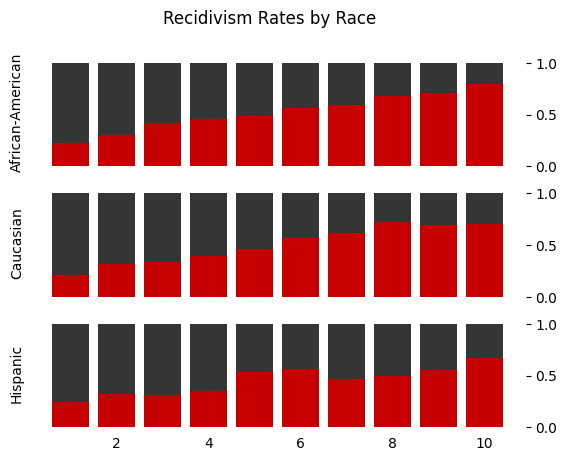
Now we can explore the relationship between the risk score and actual two year recidivism.
The first measure we look at is the frequency of recidivism by decile score – these numbers tell us what percentage of people assigned a particular risk score committed a new crime within two years of being released.
df.groupby("decile_score")["two_year_recid"].mean()
decile_score
1     0.220392
2     0.309112
3     0.375887
4     0.426593
5     0.478723
6     0.564228
7     0.590988
8     0.681363
9     0.698795
10    0.770889
Name: two_year_recid, dtype: float64
Let’s also look at the correlation.
df[["decile_score", "two_year_recid"]].corr()
| decile_score | two_year_recid | |
|---|---|---|
| decile_score | 1.000000 | 0.346797 |
| two_year_recid | 0.346797 | 1.000000 |
As the risk score increases, the percentage of people committing a new crime does as well, with a positive correlation (~0.35).
This is good news – it means that the score is producing at least some signal about an individual’s recidivism risk.
One of the key critiques from Pro Publica, though, was that the inaccuracies were nonuniform — that is, the tool was systematically wrong about certain populations.
Let’s now separate the correlations by race and see what happens.
recid_rates = df.pivot_table(index="decile_score", columns="race", values="two_year_recid", observed=True)

recid_rates
| race | African-American | Caucasian | Hispanic |
|---|---|---|---|
| decile_score | |||
| 1 | 0.228643 | 0.208517 | 0.244898 |
| 2 | 0.302799 | 0.313019 | 0.318584 |
| 3 | 0.419075 | 0.340659 | 0.313953 |
| 4 | 0.459740 | 0.396491 | 0.346154 |
| 5 | 0.482192 | 0.460581 | 0.538462 |
| 6 | 0.559896 | 0.572165 | 0.567568 |
| 7 | 0.592500 | 0.615385 | 0.470588 |
| 8 | 0.682451 | 0.719298 | 0.500000 |
| 9 | 0.707895 | 0.693878 | 0.550000 |
| 10 | 0.793706 | 0.703125 | 0.666667 |
Or, in plotted form,
fig, ax = plt.subplots(3, sharex="all")

for (i, _race) in enumerate(["African-American", "Caucasian", "Hispanic"]):
    _rr_vals = recid_rates[_race].values

    ax[i].bar(np.arange(1, 11), _rr_vals, color="#c60000")
    ax[i].bar(np.arange(1, 11), 1 - _rr_vals, bottom=_rr_vals, color="#353535")
    ax[i].set_ylabel(_race)
    ax[i].spines["left"].set_visible(False)
    ax[i].spines["right"].set_visible(False)
    ax[i].spines["top"].set_visible(False)
    ax[i].spines["bottom"].set_visible(False)
    ax[i].yaxis.tick_right()
    ax[i].xaxis.set_ticks_position("none")

fig.suptitle("Recidivism Rates by Race")
Text(0.5, 0.98, 'Recidivism Rates by Race')
Regression#
In what follows, we will be doing something slightly different than what was done in the Pro Publica article.
First, we will explore what happens when we try to predict the COMPAS risk scores using the observable data that we have.
Second, we will use binary probability models to predict whether an individual is at risk of recidivism.
We will do this first using the COMPAS risk scores, and then afterwards we will try to write our own model based on raw observables, like age, race and sex.
Preprocessing#
We would like to use some features that are inherently non-numerical such as sex, age group, and race in our model.
Before we can do that, we need to encode these string values as numerical values so our machine learning algorithms can understand them – an econometrician would call this, creating dummy variables.
sklearn can automatically do this for us using OneHotEncoder.
Essentially, we make one column for each possible value of a categorical variable and then we set just one of these columns equal to a 1 if the observation has that column’s category, and set all other columns to 0.
Let’s do an example.
Imagine we have the array below.
sex = np.array([["Male"], ["Female"], ["Male"], ["Male"], ["Female"]])
The way to encode this would be to create the array below.
sex_encoded = np.array([
    [0.0, 1.0],
    [1.0, 0.0],
    [0.0, 1.0],
    [0.0, 1.0],
    [1.0, 0.0]
])
Using sklearn it would be:
ohe = preprocessing.OneHotEncoder(sparse_output=False)
sex_ohe = ohe.fit_transform(sex)

# This should shows 0s!
sex_ohe - sex_encoded
array([[0., 0.],
       [0., 0.],
       [0., 0.],
       [0., 0.],
       [0., 0.]])
We will use this encoding trick below as we create our data.
Predicting COMPAS Scores#
First, we proceed by creating the X and y inputs into a manageable format.
We encode the categorical variables using the OneHotEncoder described above, and then merge that with the non-categorical data.
Finally, we split the data into training and validation (test) subsets.
def prep_data(df, continuous_variables, categories, y_var, test_size=0.15):

    ohe = preprocessing.OneHotEncoder(sparse_output=False)

    y = df[y_var].values
    X = np.zeros((y.size, 0))

    # Add continuous variables if exist
    if len(continuous_variables) > 0:
        X = np.hstack([X, df[continuous_variables].values])

    if len(categories) > 0:
        X = np.hstack([X, ohe.fit_transform(df[categories])])

    X_train, X_test, y_train, y_test = model_selection.train_test_split(
        X, y, test_size=test_size, random_state=42
    )

    return X_train, X_test, y_train, y_test
As we proceed, our goal will be to see which variables are most important for predicting the COMPAS scores.
As we estimate these models, one of our metrics for success will be mean absolute error (MAE).
def fit_and_report_maes(mod, X_train, X_test, y_train, y_test, y_transform=None, y_inv_transform=None):
    if y_transform is not None:
        mod.fit(X_train, y_transform(y_train))
    else:
        mod.fit(X_train, y_train)

    yhat_train = mod.predict(X_train)
    yhat_test = mod.predict(X_test)

    if y_transform is not None:
        yhat_train = y_inv_transform(yhat_train)
        yhat_test = y_inv_transform(yhat_test)

    return dict(
        mae_train=metrics.mean_absolute_error(y_train, yhat_train),
        mae_test=metrics.mean_absolute_error(y_test, yhat_test)
    )
Let’s begin with a simple linear model which uses just prior arrests.
X_train, X_test, y_train, y_test = prep_data(
    df, ["priors_count"], [], "decile_score"
)

fit_and_report_maes(linear_model.LinearRegression(), X_train, X_test, y_train, y_test)
{'mae_train': 2.162527833108664, 'mae_test': 2.191754484529134}
This simple model obtains a MAE of about 2 for both the test data and training data.
This means, on average, that our model can predict the COMPAS score (which ranges from 1-10) within about 2 points.
While the MAE is about 2, knowing what the errors on our prediction model look like is often very useful.
Below, we create a histogram which shows the distribution of these errors. In our case, we take the difference between predicted value and actual value, so a positive value means that we overpredicted the COMPAS score and a negative value means we underpredicted it.
lr_model = linear_model.LinearRegression()
lr_model.fit(X_train, y_train)

yhat_train = lr_model.predict(X_train)
yhat_test = lr_model.predict(X_test)

fig, ax = plt.subplots(1, 2, figsize=(12, 4), sharey="all")

ax[0].hist(yhat_train - y_train, density=True)
ax[0].set_title("Training Data")
ax[1].hist(yhat_test - y_test, density=True)
ax[1].set_title("Test Data")
Text(0.5, 1.0, 'Test Data')
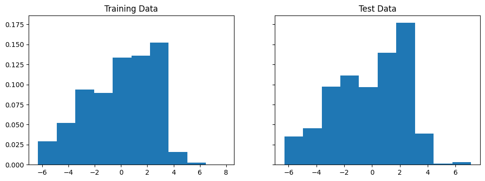
In both cases, the long left tails of errors suggest the existence of relevant features which would improve our model.
The first thing we might consider investigating is whether there are non-linearities in how the number of priors enters the COMPAS score.
First, we try using polynomial features in our exogenous variables.
X_train, X_test, y_train, y_test = prep_data(
    df, ["priors_count"], [], "decile_score"
)

# Transform data to quadratic
pf = preprocessing.PolynomialFeatures(2, include_bias=False)
X_train = pf.fit_transform(X_train)
X_test = pf.fit_transform(X_test)

fit_and_report_maes(linear_model.LinearRegression(), X_train, X_test, y_train, y_test)
{'mae_train': 2.120405801755292, 'mae_test': 2.1179838134597335}
We don’t see a very significant increase in performance, so we also try using log on the endogenous variables.
X_train, X_test, y_train, y_test = prep_data(
    df, ["priors_count"], [], "decile_score"
)

fit_and_report_maes(
    linear_model.LinearRegression(), X_train, X_test, y_train, y_test,
    y_transform=np.log, y_inv_transform=np.exp
)
{'mae_train': 2.2550821558610115, 'mae_test': 2.3332184125647917}
Still no improvement… The next natural thing is to add more features to our regression.
X_train, X_test, y_train, y_test = prep_data(
    df, ["priors_count"], ["age_cat", "race", "sex"], "decile_score"
)

fit_and_report_maes(linear_model.LinearRegression(), X_train, X_test, y_train, y_test)
{'mae_train': 1.8076563650603423, 'mae_test': 1.8277010173497896}
By allowing for indicator variables on age, race, and sex, we are able to slightly improve the MAE. The errors also seem to have a less extreme tail.
X_train, X_test, y_train, y_test = prep_data(
    df, ["priors_count"], ["age_cat", "race", "sex"], "decile_score"
)

lr_model = linear_model.LinearRegression()
lr_model.fit(X_train, y_train)

yhat_train = lr_model.predict(X_train)
yhat_test = lr_model.predict(X_test)

fig, ax = plt.subplots(1, 2, figsize=(12, 4), sharey="all")

ax[0].hist(yhat_train - y_train, density=True)
ax[0].set_title("Training Data")
ax[1].hist(yhat_test - y_test, density=True)
ax[1].set_title("Test Data")
Text(0.5, 1.0, 'Test Data')
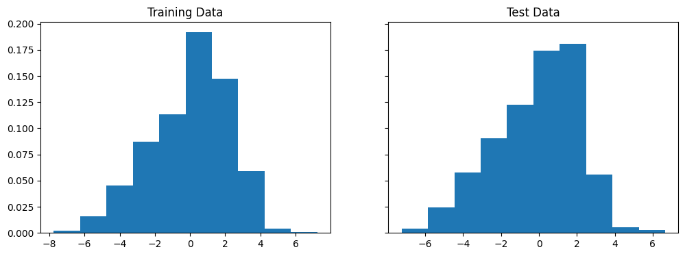
The coefficients are listed below:
names = [
    "priors_count", "Less than 25", "25-45", "Greater than 45", "African-American",
    "Caucasian", "Hispanic", "Female", "Male"
]
for (_name, _coef) in zip(names, lr_model.coef_):
    print(_name, ": ", _coef)
priors_count :  0.2799923049684579
Less than 25 :  -0.10262755807946589
25-45 :  -1.7189018948181365
Greater than 45 :  1.8215294528975996
African-American :  0.6102522379830785
Caucasian :  -0.10156939689442401
Hispanic :  -0.5086828410886544
Female :  0.04293582427466183
Male :  -0.04293582427466186
What stands out to you about these coefficients?
Exercise
See exercise 1 in the exercise list.
Binary Probability Models#
Binary probability models are used to model “all or nothing” outcomes, like the occurrence of an event.
Their output is the probability that an event of interest occurs.
With this probability in hand, the researcher chooses an acceptable cutoff (perhaps 0.5) above which the event is predicted to occur.
Note
Binary probability models can be thought of as a special case of classification.
In classification, we are given a set of features and asked to predict one of a finite number of discrete labels.
We will learn more about classification in an upcoming lecture!
In our example, we will be interested in how the COMPAS scores do at predicting recidivism and how their ability to predict depends on race or sex.
To assist us in evaluating the performance of various models we will use a new metric called the confusion matrix.
Scikit-learn knows how to compute this metric and also provides a good description of what is computed.
Let’s see what they have to say.
help(metrics.confusion_matrix)
Help on function confusion_matrix in module sklearn.metrics._classification:

confusion_matrix(y_true, y_pred, *, labels=None, sample_weight=None, normalize=None)
    Compute confusion matrix to evaluate the accuracy of a classification.

    By definition a confusion matrix :math:`C` is such that :math:`C_{i, j}`
    is equal to the number of observations known to be in group :math:`i` and
    predicted to be in group :math:`j`.

    Thus in binary classification, the count of true negatives is
    :math:`C_{0,0}`, false negatives is :math:`C_{1,0}`, true positives is
    :math:`C_{1,1}` and false positives is :math:`C_{0,1}`.

    Read more in the :ref:`User Guide <confusion_matrix>`.

    Parameters
    ----------
    y_true : array-like of shape (n_samples,)
        Ground truth (correct) target values.

    y_pred : array-like of shape (n_samples,)
        Estimated targets as returned by a classifier.

    labels : array-like of shape (n_classes), default=None
        List of labels to index the matrix. This may be used to reorder
        or select a subset of labels.
        If ``None`` is given, those that appear at least once
        in ``y_true`` or ``y_pred`` are used in sorted order.

    sample_weight : array-like of shape (n_samples,), default=None
        Sample weights.

        .. versionadded:: 0.18

    normalize : {'true', 'pred', 'all'}, default=None
        Normalizes confusion matrix over the true (rows), predicted (columns)
        conditions or all the population. If None, confusion matrix will not be
        normalized.

    Returns
    -------
    C : ndarray of shape (n_classes, n_classes)
        Confusion matrix whose i-th row and j-th
        column entry indicates the number of
        samples with true label being i-th class
        and predicted label being j-th class.

    See Also
    --------
    ConfusionMatrixDisplay.from_estimator : Plot the confusion matrix
        given an estimator, the data, and the label.
    ConfusionMatrixDisplay.from_predictions : Plot the confusion matrix
        given the true and predicted labels.
    ConfusionMatrixDisplay : Confusion Matrix visualization.

    References
    ----------
    .. [1] `Wikipedia entry for the Confusion matrix
           <https://en.wikipedia.org/wiki/Confusion_matrix>`_
           (Wikipedia and other references may use a different
           convention for axes).

    Examples
    --------
    >>> from sklearn.metrics import confusion_matrix
    >>> y_true = [2, 0, 2, 2, 0, 1]
    >>> y_pred = [0, 0, 2, 2, 0, 2]
    >>> confusion_matrix(y_true, y_pred)
    array([[2, 0, 0],
           [0, 0, 1],
           [1, 0, 2]])

    >>> y_true = ["cat", "ant", "cat", "cat", "ant", "bird"]
    >>> y_pred = ["ant", "ant", "cat", "cat", "ant", "cat"]
    >>> confusion_matrix(y_true, y_pred, labels=["ant", "bird", "cat"])
    array([[2, 0, 0],
           [0, 0, 1],
           [1, 0, 2]])

    In the binary case, we can extract true positives, etc. as follows:

    >>> tn, fp, fn, tp = confusion_matrix([0, 1, 0, 1], [1, 1, 1, 0]).ravel()
    >>> (tn, fp, fn, tp)
    (np.int64(0), np.int64(2), np.int64(1), np.int64(1))
def report_cm(mod, X_train, X_test, y_train, y_test):
     return dict(
         cm_train=metrics.confusion_matrix(y_train, mod.predict(X_train)),
         cm_test=metrics.confusion_matrix(y_test, mod.predict(X_test))
     )
We will start by using logistic regression using only decile_score
as a feature and then examine how the confusion matrices differ by
race and sex.
from patsy import dmatrices
groups = [
    "overall", "African-American", "Caucasian", "Hispanic", "Female", "Male"
]

ind = [
    "Portion_of_NoRecid_and_LowRisk", "Portion_of_Recid_and_LowRisk",
    "Portion_of_NoRecid_and_HighRisk", "Portion_of_Recid_and_HighRisk"
]

fmla = "two_year_recid ~ C(decile_score)"
y,X = dmatrices(fmla, df)
X_train, X_test, y_train, y_test, df_train, df_test = model_selection.train_test_split(
    X,y.reshape(-1),df, test_size=0.25, random_state=42
)


decile_mod = linear_model.LogisticRegression(solver="lbfgs").fit(X_train,y_train)

def cm_tables(pred, y, df):
    output = pd.DataFrame(index=ind, columns=groups)
    for group in groups:
        if group in ["African-American", "Caucasian", "Hispanic"]:
            subset=(df.race==group)
        elif group in ["Female", "Male"]:
            subset=(df.sex==group)
        else:
            subset=np.full(y.shape, True)

        y_sub = y[subset]
        pred_sub = pred[subset]

        cm = metrics.confusion_matrix(y_sub, pred_sub)

        # Compute fraction for which the guess is correct
        total = cm.sum()
        vals = np.array(cm/total)
        output.loc[:, group] = vals.reshape(-1)


    def cond_probs(col, axis):
        d=int(np.sqrt(len(col)))
        pcm = np.array(col).reshape(d,d)
        pcm = pcm/pcm.sum(axis=axis, keepdims=True)
        return(pcm.reshape(-1))

    given_outcome = output.copy()
    given_outcome.index = ["P(LowRisk|NoRecid)","P(HighRisk|NoRecid)","P(LowRisk|Recid)","P(HighRisk|Recid)"]
    given_outcome=given_outcome.apply(lambda c: cond_probs(c,1))

    given_pred = output.copy()
    given_pred.index = ["P(NoRecid|LowRisk)","P(NoRecid|HighRisk)","P(Recid|LowRisk)","P(Recid|HighRisk)"]
    given_pred=given_pred.apply(lambda c: cond_probs(c,0))
    return(output,given_outcome, given_pred)

output, given_outcome, given_pred =cm_tables(decile_mod.predict(X_test),
                                             y_test, df_test)
output
| overall | African-American | Caucasian | Hispanic | Female | Male | |
|---|---|---|---|---|---|---|
| Portion_of_NoRecid_and_LowRisk | 0.361815 | 0.26327 | 0.475 | 0.522581 | 0.43804 | 0.342222 |
| Portion_of_Recid_and_LowRisk | 0.191514 | 0.230361 | 0.136667 | 0.167742 | 0.207493 | 0.187407 |
| Portion_of_NoRecid_and_HighRisk | 0.152033 | 0.140127 | 0.168333 | 0.16129 | 0.14121 | 0.154815 |
| Portion_of_Recid_and_HighRisk | 0.294638 | 0.366242 | 0.22 | 0.148387 | 0.213256 | 0.315556 |
output contains information on the percent of true negatives, false negatives, false positives,
and true positives.
What do you see?
The joint probabilities (of prediction and outcome given race or sex) in the above table are a bit hard to interpret.
Conditional probabilities can be easier to think about.
Let’s look at the probability of outcomes given the prediction as well as race or sex.
given_pred
| overall | African-American | Caucasian | Hispanic | Female | Male | |
|---|---|---|---|---|---|---|
| P(NoRecid|LowRisk) | 0.704128 | 0.652632 | 0.738342 | 0.764151 | 0.756219 | 0.688525 |
| P(NoRecid|HighRisk) | 0.393939 | 0.386121 | 0.383178 | 0.530612 | 0.493151 | 0.372607 |
| P(Recid|LowRisk) | 0.295872 | 0.347368 | 0.261658 | 0.235849 | 0.243781 | 0.311475 |
| P(Recid|HighRisk) | 0.606061 | 0.613879 | 0.616822 | 0.469388 | 0.506849 | 0.627393 |
As you can see, the distribution of outcomes conditional on predictions does not vary too much with race.
Moreover, if anything, it discriminates in favor of African-Americans.
The algorithm does appear to overpredict recidivism for women compared to men.
This is an important concern.
We will not discuss it too much though because (1) we will see below that when fairness is looked at in another way, women are favored over men, and (2) the company that produces COMPAS also produces a separate questionnaire and risk score designed only for women.
False Positive and Negative Rates#
What if we flip this around and look at the distributions of predictions conditional on outcomes?
Why look at these probabilities?
One reason is that in law, it’s traditionally far worse to punish innocents than let the guilty free. This idea goes at least back to 1760 and Blackstone’s ratio.
It is better that ten guilty persons escape than that one innocent suffer. -William Blackstone
Blackstone’s ratio says that we should be particularly concerned about P(HighRisk | NoRecid).
This probability is also called the false positive rate.
given_outcome
| overall | African-American | Caucasian | Hispanic | Female | Male | |
|---|---|---|---|---|---|---|
| P(LowRisk|NoRecid) | 0.653887 | 0.533333 | 0.776567 | 0.757009 | 0.678571 | 0.646154 |
| P(HighRisk|NoRecid) | 0.346113 | 0.466667 | 0.223433 | 0.242991 | 0.321429 | 0.353846 |
| P(LowRisk|Recid) | 0.340369 | 0.27673 | 0.433476 | 0.520833 | 0.398374 | 0.329134 |
| P(HighRisk|Recid) | 0.659631 | 0.72327 | 0.566524 | 0.479167 | 0.601626 | 0.670866 |
Now we see some large disparities by race in the false positive rate (and false negative rate). This is one of the main findings of the Pro Publica article.
In response to Pro Publica, Northpointe, the company that produces COMPAS, argued that COMPAS is not biased because the probabilities of outcomes conditional on predictions (like P(NoRecid|LowRisk)) are approximately equal across races [recidDMB16].
Following [recidKLL+17], we will call a prediction algorithm with this property well-calibrated.
Being well-calibrated is one criteria for fairness of a prediction algorithm.
Pro Publica’s critique focuses on a different criteria – that the the probability of predicted categories conditional on true outcomes should be equal across groups (i.e. P(HighRisk|NoRecid) should be equal across races).
[recidKLL+17] calls a prediction algorithm with this property balanced.
Visualizing Calibration and Balance#
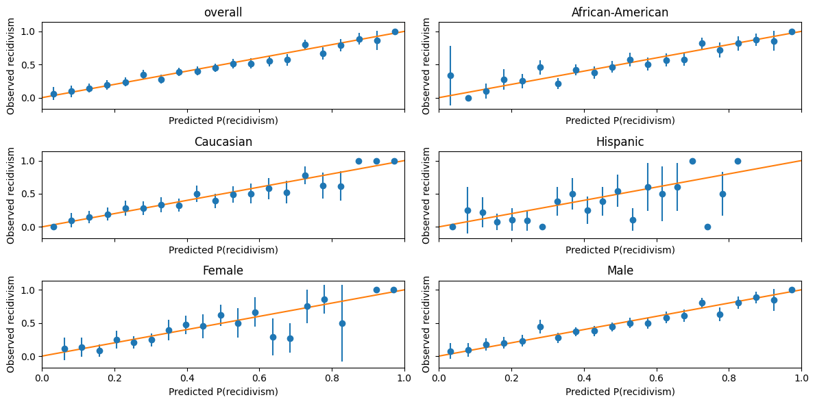
We can get a slightly more detailed look at calibration and balance by recognizing that prediction algorithms typically compute a predicted probability, not just a discrete predicted outcome.
The predicted outcome will typically be assigned to the category with the highest predicted probability.
We can examine calibration graphically by plotting the P(recidivism | predicted probability)
import scipy
def calibration_plot(pred, y, df, bins=20):
fig,ax = plt.subplots(3,2, figsize=(12,6), sharey=True, sharex=True)
for (g,group) in enumerate(groups):
if group in ["African-American", "Caucasian", "Hispanic"]:
subset=(df.race==group)
elif group in ["Female", "Male"]:
subset=(df.sex==group)
else:
subset=np.full(y.shape,True)
_ax = ax[np.unravel_index(g, ax.shape)]
y_sub = y[subset]
pred_sub = pred[subset]
mu, edges, n=scipy.stats.binned_statistic(pred_sub,y_sub,'mean',bins=bins)
se, edges,n=scipy.stats.binned_statistic(pred_sub,y_sub,
lambda x: np.std(x)/np.sqrt(len(x)),bins=bins)
midpts = (edges[0:-1]+edges[1:])/2
_ax.errorbar(midpts, mu, yerr=1.64*se, fmt='o')
_ax.set_title(group)
_ax.set_ylabel("Observed recidivism")
_ax.set_xlabel("Predicted P(recidivism)")
x = np.linspace(*_ax.get_xlim())
_ax.plot(x, x)
_ax.set_xlim(0.0,1.0)
fig.tight_layout()
return(fig,ax)
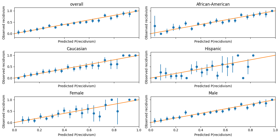
calibration_plot(decile_mod.predict_proba(X_test)[:,1],
df_test["two_year_recid"],
df_test);
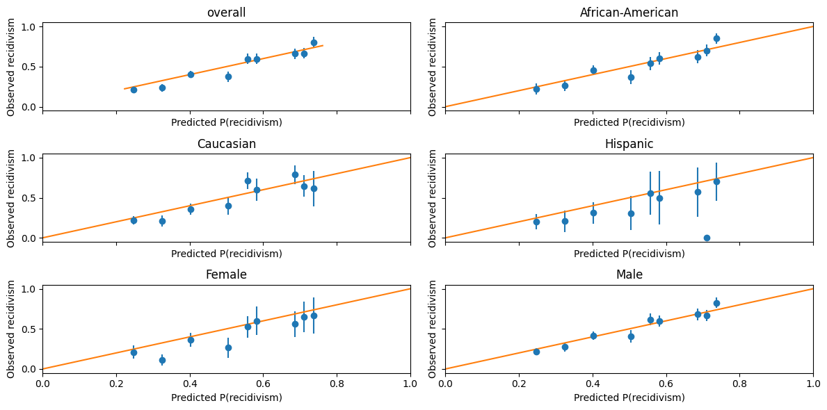
This figure is one way to visualize how well-calibrated these predictions are.
The dots are binned averages of observed recidivism, conditional on predicted recidivism being in some range.
The error bars represent a 90% confidence interval.
A perfectly calibrated prediction would have these dots all lie along the 45 degree line.
For dots below the 45 degree line, the algorithm is overpredicting recidivism.
Exercise
See exercise 2 in the exercise list.
The algorithm appears fairly well-calibrated.
It does not seem to be making systematic errors in one direction based on any particular race– but it does appear to be systematic overprediction for females compared to males.
Now, let’s create a figure to examine balance.
Balance is about the distribution of predictions conditional on outcomes, so we will plot histograms of predicted probabilities conditional on realized outcomes.
import seaborn as sns
def balance_hist_plot(pred, y, df, bins=20):
    fig,ax = plt.subplots(3,2, figsize=(12,6), sharey=True, sharex=True)
    for (g,group) in enumerate(groups):
        if group in ["African-American", "Caucasian", "Hispanic"]:
            subset=(df.race==group)
        elif group in ["Female", "Male"]:
            subset=(df.sex==group)
        else:
            subset=np.full(y.shape,True)
        _ax = ax[np.unravel_index(g, ax.shape)]
        y_sub = y[subset]
        pred_sub = pred[subset]
        sns.histplot(pred_sub[y_sub==0], bins=bins, kde=False, ax=_ax,
                     label="No recidivate")
        sns.histplot(pred_sub[y_sub==1], bins=bins, kde=False, ax=_ax,
                     label="Yes recidivate")
        _ax.set_title(group)

    plt.legend()
    fig.tight_layout()
    return(fig,ax)

balance_hist_plot(decile_mod.predict_proba(X_test)[:,1],
                  df_test["two_year_recid"],
                  df_test);
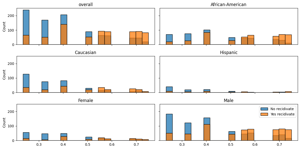
This figure is somewhat useful, but not for depicting balance especially clearly, so let’s try something else.
To get false positive and false negative rates, we must assign the predicted probabilities to outcomes.
The most common choice would be to predict recidivism if the predicted probability is greater than 0.5.
However, if we want to adjust the false positive and false negative rates, we might want to choose some other threshold and predict recidivism if the predicted probability exceeds this threshold.
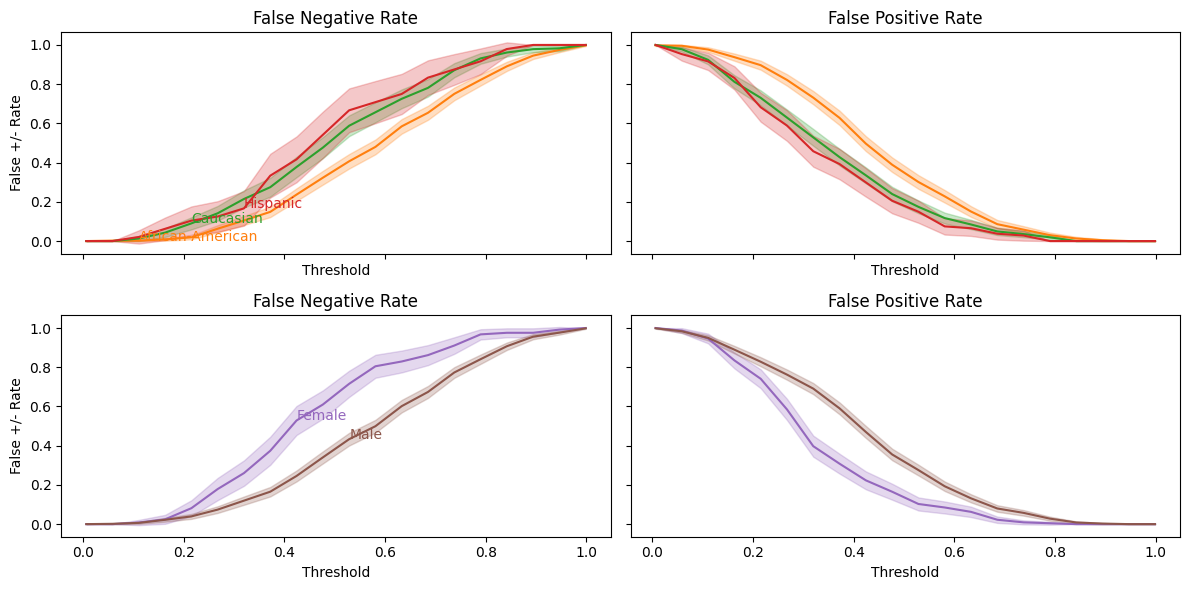
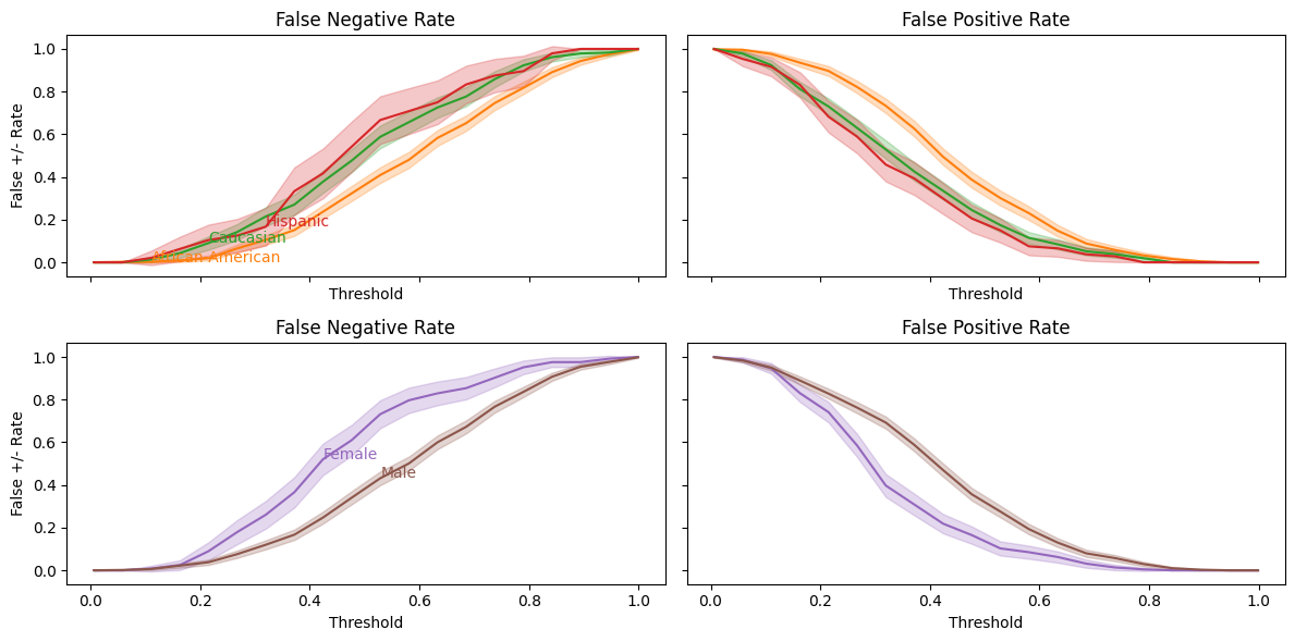
Different thresholds will lead to different false negative and false positive rates, so let’s plot these rates as functions of the threshold.
def balance_threshold_plot(pred, y, df, bins=20):
    fig,ax = plt.subplots(2,2, figsize=(12,6), sharey=True,
                          sharex=True)
    x = np.linspace(min(pred), max(pred), bins)
    # get colors defined by theme
    colors=plt.rcParams["axes.prop_cycle"].by_key()["color"]
    for (g, group) in enumerate(groups):
        if group in ["African-American", "Caucasian", "Hispanic"]:
            subset=(df.race==group)
            r = 0
        elif group in ["Female", "Male"]:
            subset=(df.sex==group)
            r = 1
        else:
            continue
        y_sub = y[subset]
        pred_sub = pred[subset]
        _ax = ax[r,0]
        fn = np.array([np.mean(pred_sub[y_sub==1]<xi) for xi in x])
        c1 = sum(y_sub==1)
        sen = np.sqrt(fn*(1-fn)/c1)
        fp = np.array([np.mean(pred_sub[y_sub==0]>xi) for xi in x])
        c0 = sum(y_sub==0)
        sep = np.sqrt(fp*(1-fp)/c0)
        p=_ax.plot(x, fn, color=colors[g])
        _ax.fill_between(x, fn-1.64*sen, fn+1.64*sen, alpha=0.25, color=colors[g])
        _ax.annotate(group, (x[bins//7*g], fn[bins//7*g]), color=colors[g])
        _ax.set_ylabel("False +/- Rate")
        _ax.set_xlabel("Threshold")
        _ax.set_title("False Negative Rate")

        _ax = ax[r,1]
        p=_ax.plot(x, fp, color=colors[g])
        _ax.fill_between(x, fp-1.64*sep, fp+1.64*sep, alpha=0.25, color=colors[g])
        _ax.set_xlabel("Threshold")
        _ax.set_title("False Positive Rate")

    fig.tight_layout()
    return(fig,ax)

balance_threshold_plot(decile_mod.predict_proba(X_test)[:,1],
                       df_test["two_year_recid"],
                       df_test);
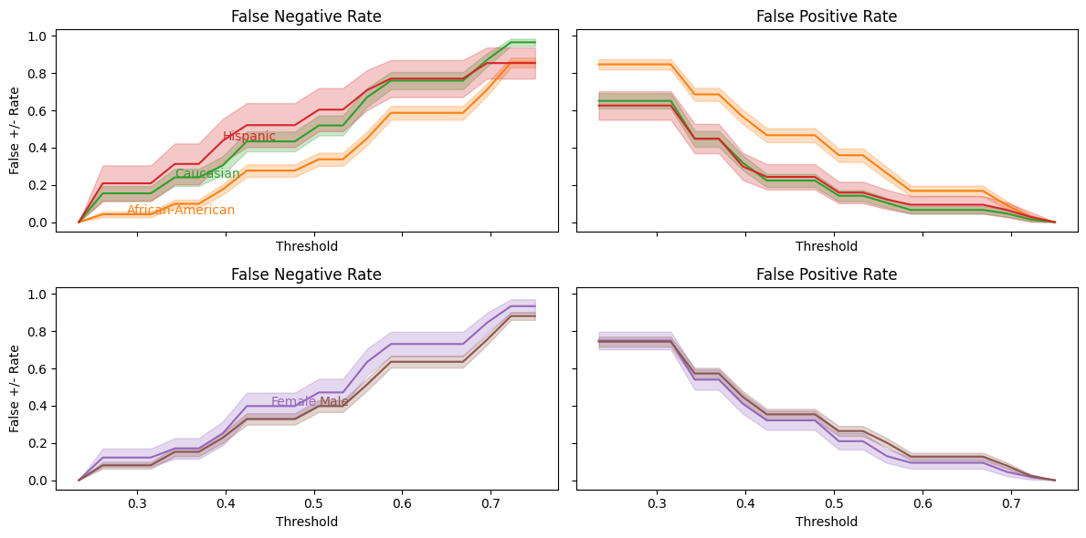
From this, we can more easily see the balance problem — regardless of which threshold we choose, African-Americans will have a higher false positive rate than Caucasians.
We have seen that COMPAS scores are well-calibrated conditional on race, but not balanced.
Can we create an alternative prediction that is both well-calibrated and balanced?
Creating an Alternative Prediction#
As a starting exercise, let’s predict recidivism using the variables in this dataset other than race and COMPAS score.
Almost all variables in this data are categorical.
Any function of categorical variables can be represented as a linear function of indicator variables and their interactions.
Given that linearity in indicators does not impose any substantiative restriction here, a penalized linear model like lasso seems like a good choice for prediction.
To keep the computation time reasonable, we do not include all interaction and indicator terms here.
To ensure that predicted probabilities are between 0 and 1, we fit a logistic regression with an \(\ell-1\) penalty.
from sklearn import model_selection, linear_model
from patsy import dmatrices

# charge_desc has many values with one observations, we will
# combine these descriptions into a single "other." This could
# be improved upon by looking at the text of descriptions and
# combining.
df.c_charge_desc = df.c_charge_desc.fillna("")
df["charge_cat"] = df.c_charge_desc
cnt = df.c_charge_desc.value_counts()[df.c_charge_desc]
cnt.index = df.index
df.loc[cnt<10,"charge_cat"] = "other"
df.charge_cat = df.charge_cat.astype('category')
df.sex = df.sex.astype('category')


fmla = "two_year_recid ~ sex*(age + juv_fel_count + juv_misd_count + juv_other_count + C(priors_count) + c_charge_degree + charge_cat)"

y,X = dmatrices(fmla, df)
print("There are {} features".format(X.shape[1]))
X_train, X_test, y_train, y_test, df_train, df_test = model_selection.train_test_split(
    X,pd.Series(y.reshape(-1),index=df.index),df, test_size=0.25, random_state=42
)

lasso_mod=linear_model.LogisticRegressionCV(cv=5,verbose=False,
                                            Cs=10, penalty='l1',
                                            max_iter=100,
                                            scoring="neg_log_loss",
                                            solver="liblinear").fit(X_train, y_train)
There are 260 features
Let’s look at the regularization parameter chosen and the non-zero coefficients.
# plots illustrating regularization parameter choice
scores=lasso_mod.scores_[1.0].mean(axis=0)
logpenalties=np.log(lasso_mod.Cs_)
nnonzero=(np.abs(lasso_mod.coefs_paths_[1.0])>1e-6).sum(axis=2).mean(axis=0)
colors=plt.rcParams["axes.prop_cycle"].by_key()["color"]
fig, ax1 = plt.subplots()
ax1.plot(logpenalties,scores, color=colors[0])
ax1.set_ylabel("CV log likelihood", color=colors[0])
ax1.set_xlabel("-log(penalty)")
ax1.tick_params('y', colors=colors[0])
ax2 = ax1.twinx()
ax2.plot(logpenalties,nnonzero, color=colors[1])
ax2.set_ylabel("nonzero coefficients", color=colors[1])
ax2.tick_params('y', colors=colors[1])
ax2.grid(visible=False);
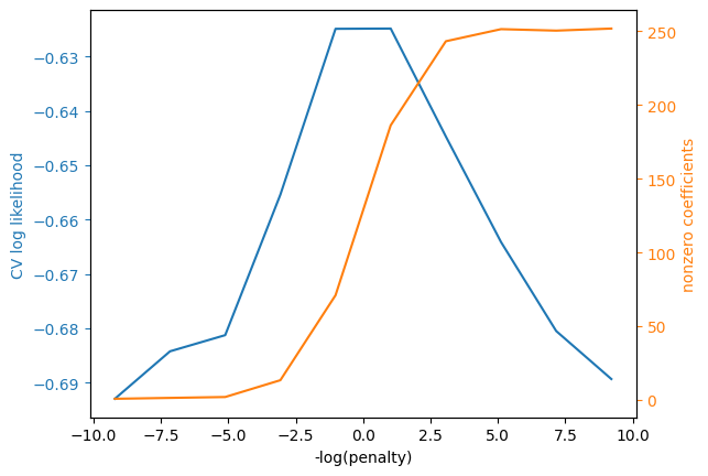
Let’s also look at the nonzero coefficients. We should be careful about interpreting these, since relatively strong assumptions are needed for lasso to produce consistent coefficient estimates.
Note
Lasso gives accurate predictions under weaker assumptions than needed for consistent coefficient estimates.
# table of nonzero coefficients
coef = pd.DataFrame(index = X.design_info.column_names, columns=["Value"])
coef.Value = np.transpose(lasso_mod.coef_)
print(sum(np.abs(coef.Value)>1.0e-8))
with pd.option_context('display.max_rows', None):
    display(coef[np.abs(coef.Value)>1.0e-8])
181
| Value | |
|---|---|
| Intercept | 0.117425 |
| sex[T.Male] | 0.540950 |
| C(priors_count)[T.1] | 0.133058 |
| C(priors_count)[T.2] | 0.596628 |
| C(priors_count)[T.3] | 0.818523 |
| C(priors_count)[T.4] | 1.237634 |
| C(priors_count)[T.5] | 1.013909 |
| C(priors_count)[T.6] | 1.076445 |
| C(priors_count)[T.7] | 1.386989 |
| C(priors_count)[T.8] | 1.809146 |
| C(priors_count)[T.9] | 2.082259 |
| C(priors_count)[T.10] | 1.417593 |
| C(priors_count)[T.11] | 1.754706 |
| C(priors_count)[T.12] | 1.774224 |
| C(priors_count)[T.13] | 1.634754 |
| C(priors_count)[T.14] | 0.676129 |
| C(priors_count)[T.15] | 1.328269 |
| C(priors_count)[T.16] | 0.773518 |
| C(priors_count)[T.17] | 0.496374 |
| C(priors_count)[T.18] | 2.677726 |
| C(priors_count)[T.19] | 2.145393 |
| C(priors_count)[T.20] | 1.235031 |
| C(priors_count)[T.21] | 2.827840 |
| C(priors_count)[T.22] | 3.418762 |
| C(priors_count)[T.23] | 3.201663 |
| C(priors_count)[T.24] | 0.315925 |
| C(priors_count)[T.25] | 3.546160 |
| C(priors_count)[T.26] | 3.728880 |
| C(priors_count)[T.27] | 0.116924 |
| C(priors_count)[T.28] | 1.010743 |
| C(priors_count)[T.29] | 1.426588 |
| C(priors_count)[T.30] | 2.572540 |
| C(priors_count)[T.31] | 0.515750 |
| C(priors_count)[T.33] | 1.152439 |
| C(priors_count)[T.36] | 0.019740 |
| C(priors_count)[T.38] | 1.196021 |
| c_charge_degree[T.M] | -0.256943 |
| charge_cat[T.Agg Battery Grt/Bod/Harm] | -0.702945 |
| charge_cat[T.Aggrav Battery w/Deadly Weapon] | -0.854309 |
| charge_cat[T.Aggravated Assault W/Dead Weap] | -0.408472 |
| charge_cat[T.Aggravated Assault W/dead Weap] | -0.970467 |
| charge_cat[T.Aggravated Assault w/Firearm] | -0.696583 |
| charge_cat[T.Aggravated Battery] | -1.436460 |
| charge_cat[T.Att Burgl Unoccupied Dwel] | -0.334452 |
| charge_cat[T.Battery] | -0.288420 |
| charge_cat[T.Battery on Law Enforc Officer] | 0.532563 |
| charge_cat[T.Battery on a Person Over 65] | 1.720150 |
| charge_cat[T.Burglary Conveyance Unoccup] | -0.377504 |
| charge_cat[T.Burglary Dwelling Assault/Batt] | 0.129761 |
| charge_cat[T.Burglary Unoccupied Dwelling] | -0.406770 |
| charge_cat[T.Carrying Concealed Firearm] | -0.007362 |
| charge_cat[T.Crim Use of Personal ID Info] | -0.528579 |
| charge_cat[T.Criminal Mischief] | 1.629296 |
| charge_cat[T.Criminal Mischief Damage <$200] | 0.308887 |
| charge_cat[T.Criminal Mischief>$200<$1000] | -0.288015 |
| charge_cat[T.Cruelty Toward Child] | -0.430937 |
| charge_cat[T.DUI - Enhanced] | -2.352184 |
| charge_cat[T.DUI Level 0.15 Or Minor In Veh] | -0.438074 |
| charge_cat[T.DUI Property Damage/Injury] | -1.430914 |
| charge_cat[T.Dealing in Stolen Property] | -0.073451 |
| charge_cat[T.Deliver 3,4 Methylenediox] | -0.681024 |
| charge_cat[T.Deliver Cocaine] | -0.697797 |
| charge_cat[T.Disorderly Conduct] | 0.035562 |
| charge_cat[T.Disorderly Intoxication] | -0.861410 |
| charge_cat[T.Driving License Suspended] | -0.366798 |
| charge_cat[T.Driving Under The Influence] | -0.203916 |
| charge_cat[T.Exposes Culpable Negligence] | -0.487108 |
| charge_cat[T.False Ownership Info/Pawn Item] | -0.375184 |
| charge_cat[T.Felony Petit Theft] | 0.552361 |
| charge_cat[T.Grand Theft (Motor Vehicle)] | 0.198248 |
| charge_cat[T.Grand Theft in the 3rd Degree] | -0.327923 |
| charge_cat[T.Leave Acc/Attend Veh/More $50] | 0.541470 |
| charge_cat[T.Leaving Acc/Unattended Veh] | -0.507080 |
| charge_cat[T.Leaving the Scene of Accident] | -0.454555 |
| charge_cat[T.Lewd or Lascivious Molestation] | -1.771977 |
| charge_cat[T.Lve/Scen/Acc/Veh/Prop/Damage] | 0.548959 |
| charge_cat[T.Operating W/O Valid License] | -0.587223 |
| charge_cat[T.Petit Theft] | 0.206024 |
| charge_cat[T.Petit Theft $100- $300] | 0.797338 |
| charge_cat[T.Pos Cannabis W/Intent Sel/Del] | -0.059599 |
| charge_cat[T.Poss 3,4 MDMA (Ecstasy)] | 0.422861 |
| charge_cat[T.Poss Contr Subst W/o Prescript] | 0.030014 |
| charge_cat[T.Poss Pyrrolidinovalerophenone] | 4.176525 |
| charge_cat[T.Poss3,4 Methylenedioxymethcath] | -2.156054 |
| charge_cat[T.Possess Cannabis/20 Grams Or Less] | -0.454759 |
| charge_cat[T.Possession Burglary Tools] | 0.007115 |
| charge_cat[T.Possession of Cannabis] | -0.670184 |
| charge_cat[T.Possession of Cocaine] | 0.436705 |
| charge_cat[T.Possession of Hydrocodone] | -0.311104 |
| charge_cat[T.Possession of Oxycodone] | 0.163206 |
| charge_cat[T.Prowling/Loitering] | 0.000276 |
| charge_cat[T.Resist Officer w/Violence] | -0.021592 |
| charge_cat[T.Robbery / No Weapon] | -1.437568 |
| charge_cat[T.Susp Drivers Lic 1st Offense] | -0.317416 |
| charge_cat[T.Tamper With Witness/Victim/CI] | 0.320580 |
| charge_cat[T.Tampering With Physical Evidence] | 1.788772 |
| charge_cat[T.Uttering a Forged Instrument] | 0.402107 |
| charge_cat[T.Viol Pretrial Release Dom Viol] | 1.169378 |
| charge_cat[T.arrest case no charge] | -0.544860 |
| charge_cat[T.other] | -0.540547 |
| sex[T.Male]:C(priors_count)[T.1] | 0.178028 |
| sex[T.Male]:C(priors_count)[T.3] | 0.202551 |
| sex[T.Male]:C(priors_count)[T.4] | -0.199630 |
| sex[T.Male]:C(priors_count)[T.5] | 0.087066 |
| sex[T.Male]:C(priors_count)[T.6] | 0.159119 |
| sex[T.Male]:C(priors_count)[T.9] | -0.374410 |
| sex[T.Male]:C(priors_count)[T.10] | 0.689153 |
| sex[T.Male]:C(priors_count)[T.12] | -0.128258 |
| sex[T.Male]:C(priors_count)[T.13] | 0.552967 |
| sex[T.Male]:C(priors_count)[T.14] | 1.185246 |
| sex[T.Male]:C(priors_count)[T.15] | 0.177870 |
| sex[T.Male]:C(priors_count)[T.16] | 1.385750 |
| sex[T.Male]:C(priors_count)[T.17] | 2.036891 |
| sex[T.Male]:C(priors_count)[T.24] | 1.774651 |
| sex[T.Male]:C(priors_count)[T.26] | 0.465583 |
| sex[T.Male]:C(priors_count)[T.27] | 0.001157 |
| sex[T.Male]:C(priors_count)[T.28] | 2.203225 |
| sex[T.Male]:C(priors_count)[T.29] | 0.590077 |
| sex[T.Male]:C(priors_count)[T.31] | 1.324545 |
| sex[T.Male]:C(priors_count)[T.33] | 0.908828 |
| sex[T.Male]:C(priors_count)[T.36] | 0.016089 |
| sex[T.Male]:C(priors_count)[T.38] | 1.339351 |
| sex[T.Male]:c_charge_degree[T.M] | 0.248640 |
| sex[T.Male]:charge_cat[T.Aggrav Battery w/Deadly Weapon] | 0.543080 |
| sex[T.Male]:charge_cat[T.Aggravated Assault W/Dead Weap] | 0.734834 |
| sex[T.Male]:charge_cat[T.Aggravated Assault W/dead Weap] | -0.147764 |
| sex[T.Male]:charge_cat[T.Aggravated Battery / Pregnant] | 0.160705 |
| sex[T.Male]:charge_cat[T.Assault] | -0.000750 |
| sex[T.Male]:charge_cat[T.Att Burgl Unoccupied Dwel] | -0.114407 |
| sex[T.Male]:charge_cat[T.Battery] | 0.188383 |
| sex[T.Male]:charge_cat[T.Battery on Law Enforc Officer] | -0.261610 |
| sex[T.Male]:charge_cat[T.Battery on a Person Over 65] | -2.353914 |
| sex[T.Male]:charge_cat[T.Burglary Conveyance Unoccup] | 1.074134 |
| sex[T.Male]:charge_cat[T.Burglary Unoccupied Dwelling] | -0.109967 |
| sex[T.Male]:charge_cat[T.Carrying Concealed Firearm] | -0.002104 |
| sex[T.Male]:charge_cat[T.Child Abuse] | -0.194947 |
| sex[T.Male]:charge_cat[T.Corrupt Public Servant] | 2.104194 |
| sex[T.Male]:charge_cat[T.Crimin Mischief Damage $1000+] | 1.127010 |
| sex[T.Male]:charge_cat[T.Criminal Mischief Damage <$200] | -0.936200 |
| sex[T.Male]:charge_cat[T.DUI Property Damage/Injury] | 0.027558 |
| sex[T.Male]:charge_cat[T.Deliver 3,4 Methylenediox] | -0.173232 |
| sex[T.Male]:charge_cat[T.Driving License Suspended] | -0.148301 |
| sex[T.Male]:charge_cat[T.Driving Under The Influence] | -0.192566 |
| sex[T.Male]:charge_cat[T.Driving While License Revoked] | -0.477151 |
| sex[T.Male]:charge_cat[T.False Ownership Info/Pawn Item] | 1.669699 |
| sex[T.Male]:charge_cat[T.Felony Battery (Dom Strang)] | -0.024284 |
| sex[T.Male]:charge_cat[T.Felony Battery w/Prior Convict] | -0.760640 |
| sex[T.Male]:charge_cat[T.Felony Driving While Lic Suspd] | 0.297810 |
| sex[T.Male]:charge_cat[T.Grand Theft (Motor Vehicle)] | -0.043348 |
| sex[T.Male]:charge_cat[T.Grand Theft in the 3rd Degree] | 0.572748 |
| sex[T.Male]:charge_cat[T.Leave Acc/Attend Veh/More $50] | -1.698392 |
| sex[T.Male]:charge_cat[T.Lewd or Lascivious Molestation] | -0.629350 |
| sex[T.Male]:charge_cat[T.Lve/Scen/Acc/Veh/Prop/Damage] | -0.385259 |
| sex[T.Male]:charge_cat[T.Neglect Child / No Bodily Harm] | -1.014339 |
| sex[T.Male]:charge_cat[T.Operating W/O Valid License] | -0.160976 |
| sex[T.Male]:charge_cat[T.Petit Theft] | 1.082026 |
| sex[T.Male]:charge_cat[T.Poss Cocaine/Intent To Del/Sel] | -1.316610 |
| sex[T.Male]:charge_cat[T.Poss3,4 Methylenedioxymethcath] | 1.845323 |
| sex[T.Male]:charge_cat[T.Possess Cannabis/20 Grams Or Less] | 0.406079 |
| sex[T.Male]:charge_cat[T.Possession Of Alprazolam] | 0.112700 |
| sex[T.Male]:charge_cat[T.Possession Of Heroin] | 0.511490 |
| sex[T.Male]:charge_cat[T.Possession Of Methamphetamine] | 0.234447 |
| sex[T.Male]:charge_cat[T.Possession of Cannabis] | -0.095142 |
| sex[T.Male]:charge_cat[T.Possession of Hydromorphone] | -0.704471 |
| sex[T.Male]:charge_cat[T.Possession of Oxycodone] | -0.818613 |
| sex[T.Male]:charge_cat[T.Prowling/Loitering] | 0.600647 |
| sex[T.Male]:charge_cat[T.Resist/Obstruct W/O Violence] | 0.402248 |
| sex[T.Male]:charge_cat[T.Robbery / No Weapon] | 0.885551 |
| sex[T.Male]:charge_cat[T.Tampering With Physical Evidence] | -1.774442 |
| sex[T.Male]:charge_cat[T.Uttering a Forged Instrument] | -0.373763 |
| sex[T.Male]:charge_cat[T.Viol Injunct Domestic Violence] | 0.752558 |
| sex[T.Male]:charge_cat[T.arrest case no charge] | 0.121332 |
| sex[T.Male]:charge_cat[T.other] | 0.221235 |
| age | -0.030196 |
| sex[T.Male]:age | -0.015465 |
| juv_fel_count | 0.399529 |
| sex[T.Male]:juv_fel_count | -0.158274 |
| juv_misd_count | -0.259212 |
| sex[T.Male]:juv_misd_count | 0.321884 |
| juv_other_count | 0.317873 |
| sex[T.Male]:juv_other_count | -0.229129 |
Now, let’s look at calibration and balance using similar tables and figures as we did above.
output, given_outcome, given_pred =cm_tables(
    lasso_mod.predict(X_test),
    y_test,
    df_test
)
display(output)
display(given_pred)
display(given_outcome)

calibration_plot(lasso_mod.predict_proba(X_test)[:,1],y_test, df_test)
balance_threshold_plot(lasso_mod.predict_proba(X_test)[:,1],y_test, df_test);
| overall | African-American | Caucasian | Hispanic | Female | Male | |
|---|---|---|---|---|---|---|
| Portion_of_NoRecid_and_LowRisk | 0.405421 | 0.328025 | 0.483333 | 0.574194 | 0.56196 | 0.365185 |
| Portion_of_Recid_and_LowRisk | 0.147908 | 0.165605 | 0.128333 | 0.116129 | 0.083573 | 0.164444 |
| Portion_of_NoRecid_and_HighRisk | 0.190925 | 0.18259 | 0.203333 | 0.193548 | 0.242075 | 0.177778 |
| Portion_of_Recid_and_HighRisk | 0.255745 | 0.323779 | 0.185 | 0.116129 | 0.112392 | 0.292593 |
| overall | African-American | Caucasian | Hispanic | Female | Male | |
|---|---|---|---|---|---|---|
| P(NoRecid|LowRisk) | 0.679842 | 0.642412 | 0.703883 | 0.747899 | 0.698925 | 0.672578 |
| P(NoRecid|HighRisk) | 0.366423 | 0.338395 | 0.409574 | 0.5 | 0.426471 | 0.359806 |
| P(Recid|LowRisk) | 0.320158 | 0.357588 | 0.296117 | 0.252101 | 0.301075 | 0.327422 |
| P(Recid|HighRisk) | 0.633577 | 0.661605 | 0.590426 | 0.5 | 0.573529 | 0.640194 |
| overall | African-American | Caucasian | Hispanic | Female | Male | |
|---|---|---|---|---|---|---|
| P(LowRisk|NoRecid) | 0.732694 | 0.664516 | 0.790191 | 0.831776 | 0.870536 | 0.68951 |
| P(HighRisk|NoRecid) | 0.267306 | 0.335484 | 0.209809 | 0.168224 | 0.129464 | 0.31049 |
| P(LowRisk|Recid) | 0.427441 | 0.360587 | 0.523605 | 0.625 | 0.682927 | 0.377953 |
| P(HighRisk|Recid) | 0.572559 | 0.639413 | 0.476395 | 0.375 | 0.317073 | 0.622047 |
As with COMPAS score, our predictions are well-calibrated, but the false negative and false positive rates are not well balanced across racial groups.
Exercise
See exercise 3 in the exercise list.
Regularizing to Maximize Balance#
Trying to improve balance by ad-hoc modifications will be difficult.
Let’s try to do it more systematically.
We usually select models and choose regularization to minimize prediction errors.
We can just as well select models and regularization parameters to optimize some other criteria.
Let’s choose the regularization parameter for lasso to maximize balance.
# define a custom CV criteria to maximize
def balance_scorer(y_true, prob, df, weights):
    ind = df.isin(y_true.index)
    df_cv = df.loc[y_true.index.values,:]
    b = df_cv.race=="African-American"
    w = df_cv.race=="Caucasian"
    y_pred = 1*(prob>0.5)
    fprb = np.mean(y_pred[(y_true==0) & b])
    fprw = np.mean(y_pred[(y_true==0) & w])
    fnrb = np.mean(y_pred[(y_true==1) & b]==0)
    fnrw = np.mean(y_pred[(y_true==1) & w]==0)
    return(-weights[0]*(fprb-fprw)**2 +
           -weights[1]*(fnrb-fnrw)**2 +
           -weights[2]*(metrics.log_loss(y_true, prob, normalize=True)))

score_params = {"df": df_train, "weights": [10.0, 1.0, 0.0]}
scorer = metrics.make_scorer(balance_scorer, **score_params, response_method="predict_proba")
grid_cv = model_selection.GridSearchCV(
    estimator=linear_model.LogisticRegression(penalty="l1",
                                              max_iter=100,
                                              solver="liblinear"),
    scoring=scorer,
    cv=5,
    param_grid={'C':
    np.exp(np.linspace(-10,10,10))},
    return_train_score=True,
    verbose=True,
    refit=True,)

balance_mod=grid_cv.fit(X_train,y_train)
Fitting 5 folds for each of 10 candidates, totalling 50 fits
# plots illustrating regularization parameter choice
def grid_cv_plot(mod, ylabel=""):
    scores=mod.cv_results_["mean_test_score"]
    Cdict=mod.cv_results_["params"]
    logpenalties=np.log([d['C'] for d in Cdict])
    colors=plt.rcParams["axes.prop_cycle"].by_key()["color"]
    fig, ax1 = plt.subplots()
    ax1.plot(logpenalties,scores, color=colors[0])
    ax1.set_ylabel(ylabel, color=colors[0])
    ax1.set_xlabel("-log(penalty)")
    ax1.tick_params('y', colors=colors[0]);
grid_cv_plot(balance_mod,"CV balance score")
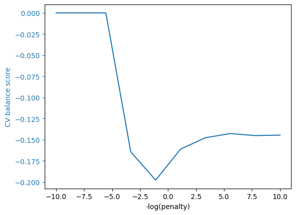
We can be perfectly balanced by making the regularization parameter very large.
Unfortunately, this makes all the predictions identical, so these predictions are not so useful.
try:
    output, given_outcome, given_pred = cm_tables(
    balance_mod.best_estimator_.predict(X_test),
    y_test,
    df_test
)

    # Ensure that the outputs are valid and check for division related issues in cm_tables

    if output is not None:
        display(output)
        display(given_pred)
    else:
        print("Predicted values are None or invalid.")

    if given_outcome is not None:
        display(given_outcome)
    else:
        print("Outcome values are None or invalid.")

except ZeroDivisionError:
    print("Caught a division by zero error in cm_tables. Please check inputs or calculations.")
except Exception as e:
    print(f"An unexpected error occurred: {e}")
Caught a division by zero error in cm_tables. Please check inputs or calculations.
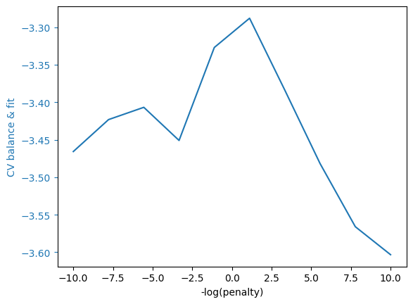
What if we change our CV scoring function to care about both prediction and balance?
score_params = {"df": df_train, "weights": [10.0, 1.0, 5.0]}
grid_cv.set_params(scoring=metrics.make_scorer(balance_scorer, **score_params, response_method="predict_proba"))
bf_mod=grid_cv.fit(X_train,y_train)
grid_cv_plot(bf_mod,"CV balance & fit")

output, given_outcome, given_pred =cm_tables(
    bf_mod.best_estimator_.predict(X_test),
    y_test,
    df_test
)
display(output)
display(given_pred)
display(given_outcome)
calibration_plot(bf_mod.best_estimator_.predict_proba(X_test)[:,1],y_test, df_test)
balance_threshold_plot(bf_mod.best_estimator_.predict_proba(X_test)[:,1],y_test, df_test);
Fitting 5 folds for each of 10 candidates, totalling 50 fits
| overall | African-American | Caucasian | Hispanic | Female | Male | |
|---|---|---|---|---|---|---|
| Portion_of_NoRecid_and_LowRisk | 0.405421 | 0.328025 | 0.483333 | 0.574194 | 0.56196 | 0.365185 |
| Portion_of_Recid_and_LowRisk | 0.147908 | 0.165605 | 0.128333 | 0.116129 | 0.083573 | 0.164444 |
| Portion_of_NoRecid_and_HighRisk | 0.189747 | 0.181529 | 0.2 | 0.2 | 0.239193 | 0.177037 |
| Portion_of_Recid_and_HighRisk | 0.256924 | 0.324841 | 0.188333 | 0.109677 | 0.115274 | 0.293333 |
| overall | African-American | Caucasian | Hispanic | Female | Male | |
|---|---|---|---|---|---|---|
| P(NoRecid|LowRisk) | 0.681188 | 0.64375 | 0.707317 | 0.741667 | 0.701439 | 0.673497 |
| P(NoRecid|HighRisk) | 0.365357 | 0.337662 | 0.405263 | 0.514286 | 0.42029 | 0.359223 |
| P(Recid|LowRisk) | 0.318812 | 0.35625 | 0.292683 | 0.258333 | 0.298561 | 0.326503 |
| P(Recid|HighRisk) | 0.634643 | 0.662338 | 0.594737 | 0.485714 | 0.57971 | 0.640777 |
| overall | African-American | Caucasian | Hispanic | Female | Male | |
|---|---|---|---|---|---|---|
| P(LowRisk|NoRecid) | 0.732694 | 0.664516 | 0.790191 | 0.831776 | 0.870536 | 0.68951 |
| P(HighRisk|NoRecid) | 0.267306 | 0.335484 | 0.209809 | 0.168224 | 0.129464 | 0.31049 |
| P(LowRisk|Recid) | 0.424802 | 0.358491 | 0.515021 | 0.645833 | 0.674797 | 0.376378 |
| P(HighRisk|Recid) | 0.575198 | 0.641509 | 0.484979 | 0.354167 | 0.325203 | 0.623622 |
Exercise
See exercise 4 in the exercise list.
Tradeoffs are Inevitable#
We could try to tweak our predictions further to improve balance.
However, motivated in part by this COMPAS example, [recidKLL+17] proved that it is impossible for any prediction algorithm to be both perfectly balanced and well-calibrated.
Improvements in balance necessarily make calibration worse.
References#
- recidDMB16
William Dieterich, Christina Mendoza, and Tim Brennan. Compas risk scales: demonstrating accuracy equity and predictive parity. Northpoint Inc, 2016.
- recidKLL+17(1,2,3)
Jon Kleinberg, Himabindu Lakkaraju, Jure Leskovec, Jens Ludwig, and Sendhil Mullainathan. Human Decisions and Machine Predictions*. The Quarterly Journal of Economics, 133(1):237–293, 08 2017. URL: https://dx.doi.org/10.1093/qje/qjx032, arXiv:http://oup.prod.sis.lan/qje/article-pdf/133/1/237/24246094/qjx032.pdf, doi:10.1093/qje/qjx032.
Exercises#
Exercise 1#
Can you develop a model that performs better at mimicking their risk scores?
Exercise 2#
We made our calibration plot using a held-out test sample. What do you think would happen if made the calibration plot using the training sample? Check and see.
# Create calibration plot using training data
Exercise 3#
Try to improve balance and/or calibration by creating an alternative prediction.
# Fit your prediction model and plot calibration and balance
Exercise 4#
Modify the cross-validation scoring function to see how it affects calibration and balance.