GroupBy#
Prerequisites
Outcomes
Understand the split-apply-combine strategy for aggregate computations on groups of data
Be able use basic aggregation methods on
df.groupbyto compute within group statisticsUnderstand how to group by multiple keys at once
Data
Details for all delayed US domestic flights in December 2016, obtained from the Bureau of Transportation Statistics
# Uncomment following line to install on colab
#! pip install
import random
import numpy as np
import pandas as pd
import matplotlib.pyplot as plt

%matplotlib inline
Split-Apply-Combine#
One powerful paradigm for analyzing data is the “Split-Apply-Combine” strategy.
This strategy has three steps:
Split: split the data into groups based on values in one or more columns.Apply: apply a function or routine to each group separately.Combine: combine the output of the apply step into a DataFrame, using the group identifiers as the index.
We will cover the main components in this lecture, but we encourage you to also study the official documentation to learn more about what is possible.
To describe the concepts, we will need some data.
We will begin with a simple made-up dataset to discuss the concepts and then work through extended example and exercises with real data.
C = np.arange(1, 7, dtype=float)
C[[3, 5]] = np.nan
df = pd.DataFrame({
    "A" : [1, 1, 1, 2, 2, 2],
    "B" : [1, 1, 2, 2, 1, 1],
    "C": C,
})
df
| A | B | C | |
|---|---|---|---|
| 0 | 1 | 1 | 1.0 |
| 1 | 1 | 1 | 2.0 |
| 2 | 1 | 2 | 3.0 |
| 3 | 2 | 2 | NaN |
| 4 | 2 | 1 | 5.0 |
| 5 | 2 | 1 | NaN |
Simple Example#
To perform the Split step, we call the groupby method on our
DataFrame.
The first argument to groupby is a description of how we want to
construct groups.
In the most basic version, we will pass a string identifying the column name.
gbA = df.groupby("A")
The type of variable we get back is a DataFrameGroupBy, which we
will sometimes refer to as GroupBy for short.
type(gbA)
pandas.core.groupby.generic.DataFrameGroupBy
Looking at the “groups” inside of the GroupBy object can help us understand what the GroupBy represents.
We can do this with the gb.get_group(group_name) method.
gbA.get_group(1)
| A | B | C | |
|---|---|---|---|
| 0 | 1 | 1 | 1.0 |
| 1 | 1 | 1 | 2.0 |
| 2 | 1 | 2 | 3.0 |
gbA.get_group(2)
| A | B | C | |
|---|---|---|---|
| 3 | 2 | 2 | NaN |
| 4 | 2 | 1 | 5.0 |
| 5 | 2 | 1 | NaN |
We can apply some of our favorite aggregation functions directly on the
GroupBy object.
Exercise
See exercise 1 in the exercise list.
Exercise
See exercise 2 in the exercise list.
If we pass a list of strings to groupby, it will group based on
unique combinations of values from all columns in the list.
Let’s see an example.
gbAB = df.groupby(["A", "B"])
type(gbAB)
pandas.core.groupby.generic.DataFrameGroupBy
gbAB.get_group((1, 1))
| A | B | C | |
|---|---|---|---|
| 0 | 1 | 1 | 1.0 |
| 1 | 1 | 1 | 2.0 |
Notice that we still have a GroupBy object, so we can apply our favorite aggregations.
gbAB.count()
| C | ||
|---|---|---|
| A | B | |
| 1 | 1 | 2 |
| 2 | 1 | |
| 2 | 1 | 1 |
| 2 | 0 |
Notice that the output is a DataFrame with two levels on the index
and a single column C. (Quiz: how do we know it is a DataFrame with
one column and not a Series?)
This highlights a principle of how pandas handles the Combine part of the strategy:
The index of the combined DataFrame will be the group identifiers, with one index level per group key.
Custom Aggregate Functions#
So far, we have been applying built-in aggregations to our GroupBy object.
We can also apply custom aggregations to each group of a GroupBy in two steps:
Write our custom aggregation as a Python function.
Passing our function as an argument to the
.aggmethod of a GroupBy.
Let’s see an example.
def num_missing(df):
    "Return the number of missing items in each column of df"
    return df.isnull().sum()
We can call this function on our original DataFrame to get the number of missing items in each column.
num_missing(df)
A    0
B    0
C    2
dtype: int64
We can also apply it to a GroupBy object to get the number of missing items in each column for each group.
gbA.agg(num_missing)
| B | C | |
|---|---|---|
| A | ||
| 1 | 0 | 0 |
| 2 | 0 | 2 |
The key to keep in mind is that the function we pass to agg should
take in a DataFrame (or Series) and return a Series (or single value)
with one item per column in the original DataFrame.
When the function is called, the data for each group will be passed to our function as a DataFrame (or Series).
Transforms: The apply Method#
As we saw in the basics lecture, we can apply transforms to DataFrames.
We can do the same with GroupBy objects using the .apply method.
Let’s see an example.
df
| A | B | C | |
|---|---|---|---|
| 0 | 1 | 1 | 1.0 |
| 1 | 1 | 1 | 2.0 |
| 2 | 1 | 2 | 3.0 |
| 3 | 2 | 2 | NaN |
| 4 | 2 | 1 | 5.0 |
| 5 | 2 | 1 | NaN |
def smallest_by_b(df):
    return df.nsmallest(2, "B")
gbA.apply(smallest_by_b, include_groups=False)
| B | C | ||
|---|---|---|---|
| A | |||
| 1 | 0 | 1 | 1.0 |
| 1 | 1 | 2.0 | |
| 2 | 4 | 1 | 5.0 |
| 5 | 1 | NaN |
Notice that the return value from applying our series transform to gbA
was the group key on the outer level (the A column) and the original
index from df on the inner level.
The original index came along because that was the index of the
DataFrame returned by smallest_by_b.
Had our function returned something other than the index from df,
that would appear in the result of the call to .apply.
Exercise
See exercise 3 in the exercise list.
pd.Grouper#
Sometimes, in order to construct the groups you want, you need to give pandas more information than just a column name.
Some examples are:
Grouping by a column and a level of the index.
Grouping time series data at a particular frequency.
pandas lets you do this through the pd.Grouper type.
To see it in action, let’s make a copy of df with A moved to the
index and a Date column added.
df2 = df.copy()
df2["Date"] = pd.date_range(
    start=pd.Timestamp.today().strftime("%m/%d/%Y"),
    freq="BQE",
    periods=df.shape[0]
)
df2 = df2.set_index("A")
df2
| B | C | Date | |
|---|---|---|---|
| A | |||
| 1 | 1 | 1.0 | 2025-03-31 |
| 1 | 1 | 2.0 | 2025-06-30 |
| 1 | 2 | 3.0 | 2025-09-30 |
| 2 | 2 | NaN | 2025-12-31 |
| 2 | 1 | 5.0 | 2026-03-31 |
| 2 | 1 | NaN | 2026-06-30 |
We can group by year.
df2.groupby(pd.Grouper(key="Date", freq="YE")).count()
| B | C | |
|---|---|---|
| Date | ||
| 2025-12-31 | 4 | 3 |
| 2026-12-31 | 2 | 1 |
We can group by the A level of the index.
df2.groupby(pd.Grouper(level="A")).count()
| B | C | Date | |
|---|---|---|---|
| A | |||
| 1 | 3 | 3 | 3 |
| 2 | 3 | 1 | 3 |
We can combine these to group by both.
df2.groupby([pd.Grouper(key="Date", freq="YE"), pd.Grouper(level="A")]).count()
| B | C | ||
|---|---|---|---|
| Date | A | ||
| 2025-12-31 | 1 | 3 | 3 |
| 2 | 1 | 0 | |
| 2026-12-31 | 2 | 2 | 1 |
And we can combine pd.Grouper with a string, where the string
denotes a column name
df2.groupby([pd.Grouper(key="Date", freq="YE"), "B"]).count()
| C | ||
|---|---|---|
| Date | B | |
| 2025-12-31 | 1 | 2 |
| 2 | 1 | |
| 2026-12-31 | 1 | 1 |
Case Study: Airline Delays#
Let’s apply our new split-apply-combine skills to the airline dataset we saw in the merge lecture.
url = "https://datascience.quantecon.org/assets/data/airline_performance_dec16.csv.zip"
air_dec = pd.read_csv(url, parse_dates = ['Date'])
First, we compute the average delay in arrival time for all carriers each week.
weekly_delays = (
    air_dec
    .groupby([pd.Grouper(key="Date", freq="W"), "Carrier"])
    ["ArrDelay"]               # extract one column
    .mean()                    # take average
    .unstack(level="Carrier")  # Flip carrier up as column names
)
weekly_delays
| Carrier | AA | AS | B6 | DL | EV | F9 | HA | NK | OO | UA | VX | WN |
|---|---|---|---|---|---|---|---|---|---|---|---|---|
| Date | ||||||||||||
| 2016-12-04 | -1.714887 | 2.724273 | -2.894269 | -5.088351 | 8.655332 | -2.894212 | -0.558282 | 5.468909 | 2.749573 | 5.564496 | -2.121821 | -1.663695 |
| 2016-12-11 | 1.148833 | 12.052031 | 5.795062 | 2.507745 | 13.220673 | 4.578861 | 2.054302 | 8.713755 | 15.429660 | 4.094176 | 12.080938 | 1.865933 |
| 2016-12-18 | 16.357561 | 7.643767 | 34.608356 | 18.000000 | 23.876622 | 45.014888 | 9.388889 | 22.857899 | 30.901639 | 22.398130 | 33.651128 | 18.373400 |
| 2016-12-25 | 6.364513 | 2.719699 | 5.586836 | -0.916113 | 6.857143 | 54.084959 | 5.075747 | 10.443369 | 15.004780 | 5.332474 | 17.286917 | 10.197685 |
| 2017-01-01 | 2.321836 | 1.226662 | 10.661577 | 2.048116 | 6.800898 | 8.280298 | 6.970016 | 8.361123 | 8.971083 | 0.061786 | 1.349580 | 5.213019 |
Let’s also plot this data.
# plot
axs = weekly_delays.plot.bar(
    figsize=(10, 8), subplots=True, legend=False, sharex=True,
    sharey=True, layout=(4, 3), grid=False
)

# tweak spacing between subplots and xaxis labels
axs[0,0].get_figure().tight_layout()
for ax in axs[-1, :]:
    ax.set_xticklabels(weekly_delays.index.strftime("%a, %b. %d'"))
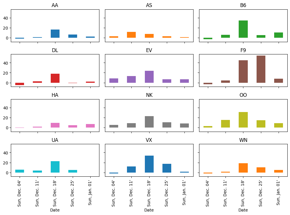
It looks like more delays occurred during the week ending Sunday December 18th than any other week (except for Frontier, who did worse on Christmas week).
Let’s see why.
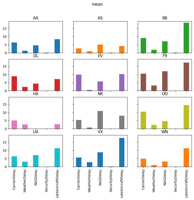
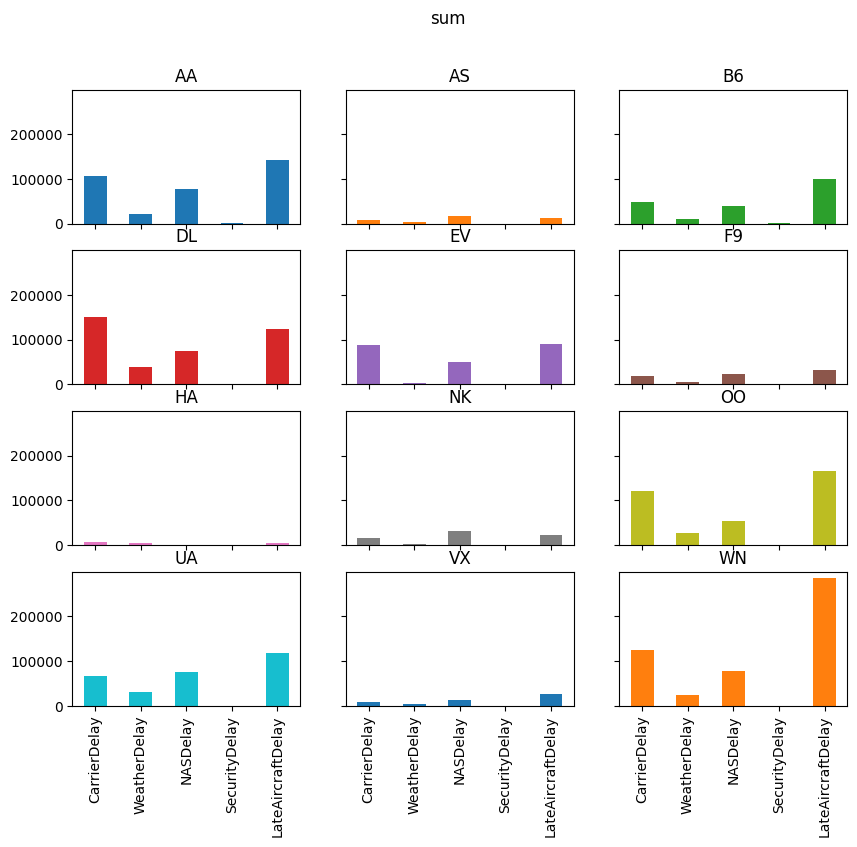
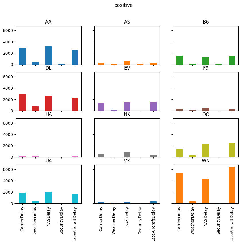
The air_dec DataFrame has information on the minutes of delay
attributed to 5 different categories:
delay_cols = [
    'CarrierDelay',
    'WeatherDelay',
    'NASDelay',
    'SecurityDelay',
    'LateAircraftDelay'
]
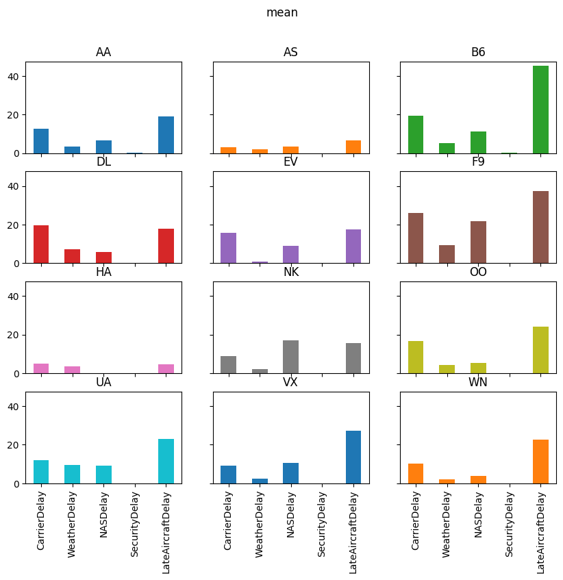
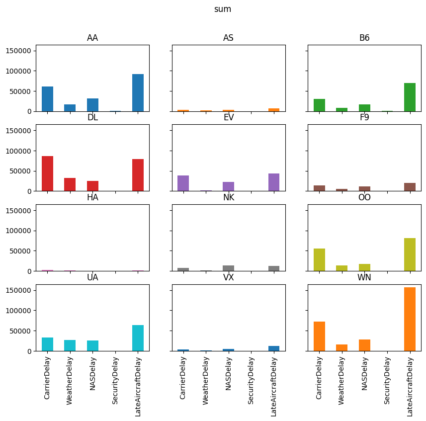
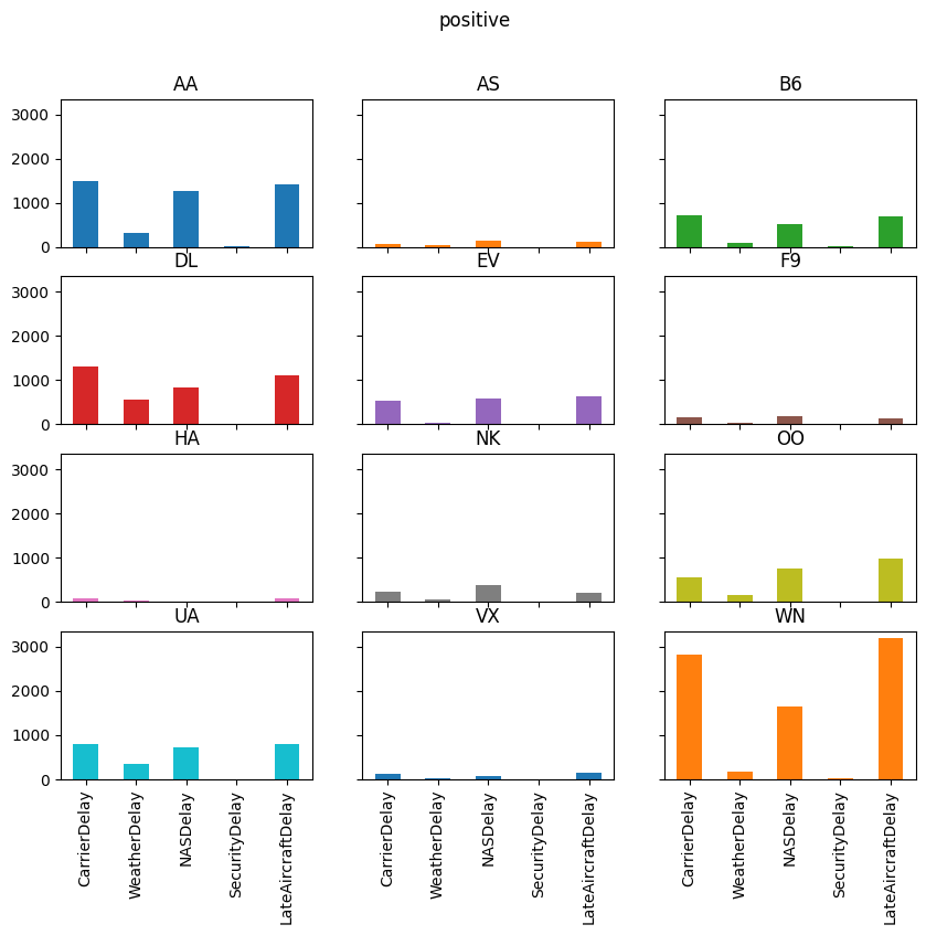
Let’s take a quick look at each of those delay categories for the week ending December 18, 2016.
pre_christmas = air_dec.loc[
(air_dec["Date"] >= "2016-12-12") & (air_dec["Date"] <= "2016-12-18")
]
# custom agg function
def positive(df):
return (df > 0).sum()
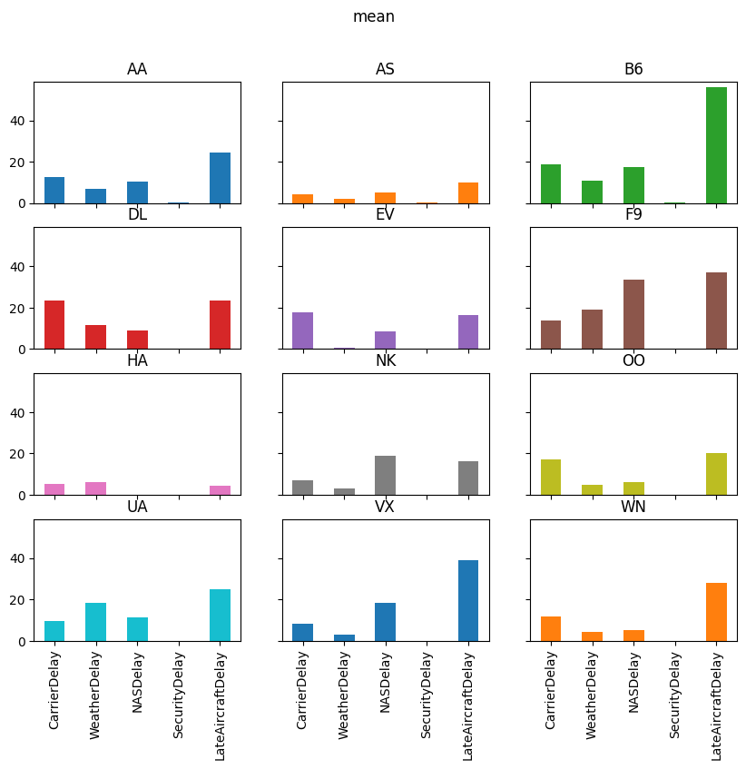
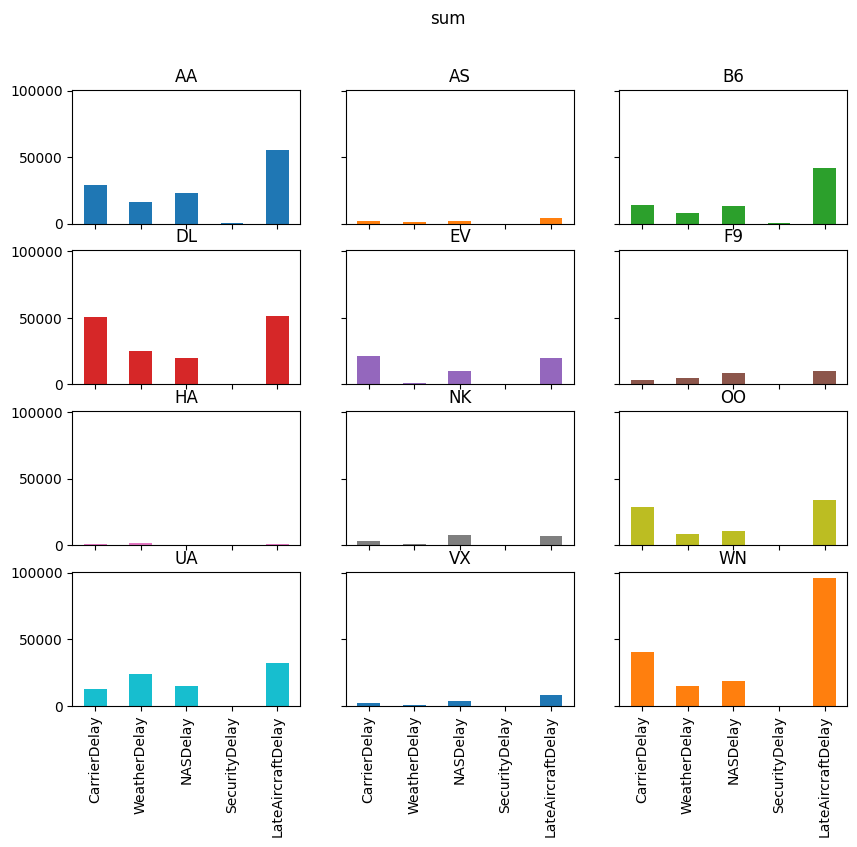
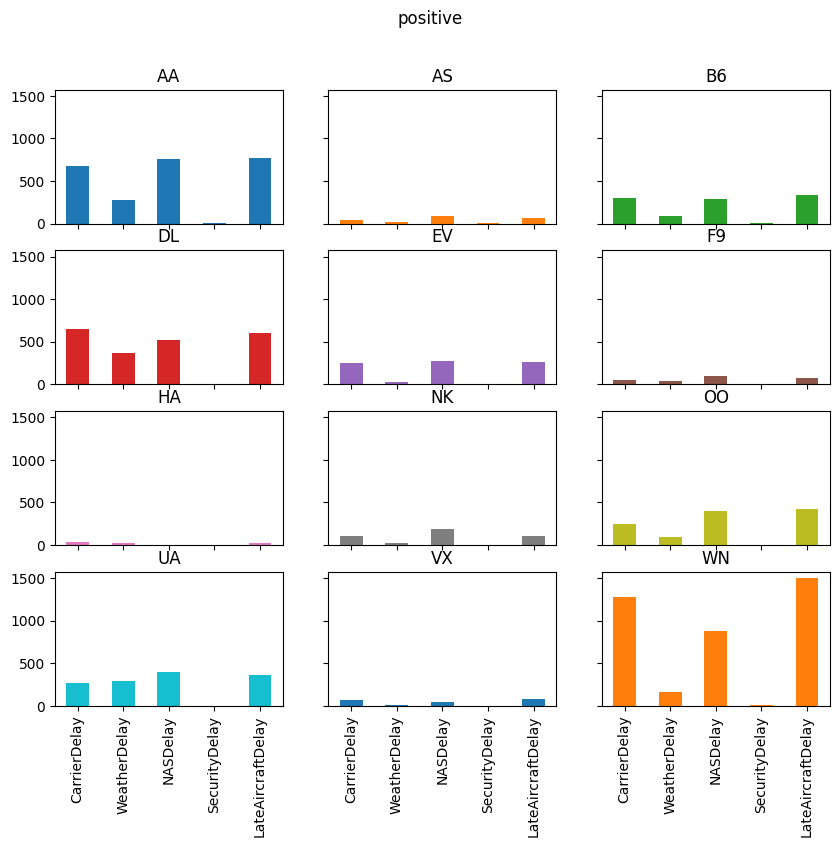
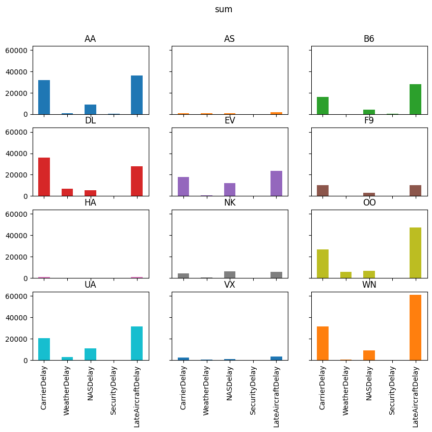
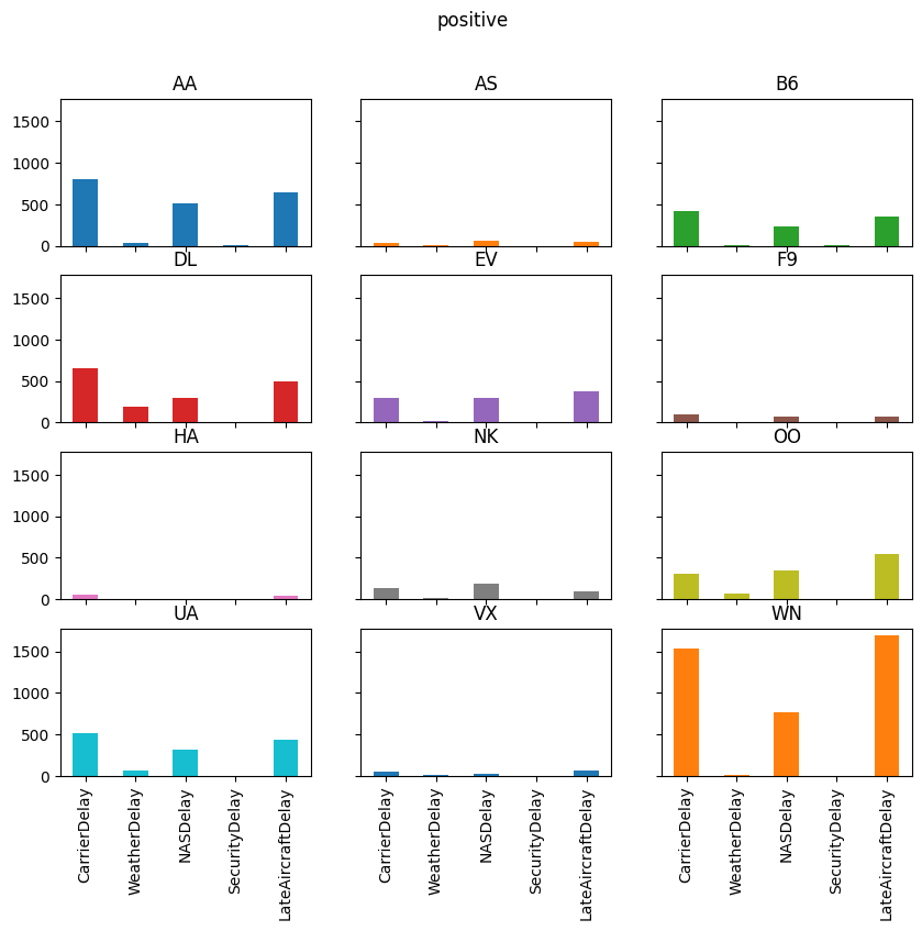
delay_totals = pre_christmas.groupby("Carrier")[delay_cols].agg(["sum", "mean", positive])
delay_totals
| CarrierDelay | WeatherDelay | NASDelay | SecurityDelay | LateAircraftDelay | |||||||||||
|---|---|---|---|---|---|---|---|---|---|---|---|---|---|---|---|
| sum | mean | positive | sum | mean | positive | sum | mean | positive | sum | mean | positive | sum | mean | positive | |
| Carrier | |||||||||||||||
| AA | 105732.0 | 6.258553 | 2922 | 21820.0 | 1.291583 | 456 | 77279.0 | 4.574346 | 3159 | 721.0 | 0.042678 | 35 | 141249.0 | 8.360897 | 2574 |
| AS | 8762.0 | 2.691032 | 250 | 3219.0 | 0.988636 | 61 | 16344.0 | 5.019656 | 614 | 163.0 | 0.050061 | 10 | 13599.0 | 4.176597 | 271 |
| B6 | 49421.0 | 9.031615 | 1575 | 9894.0 | 1.808114 | 112 | 38741.0 | 7.079861 | 1326 | 672.0 | 0.122807 | 30 | 100811.0 | 18.423063 | 1433 |
| DL | 151188.0 | 8.864212 | 2878 | 39145.0 | 2.295087 | 783 | 75110.0 | 4.403729 | 2605 | 107.0 | 0.006273 | 2 | 122896.0 | 7.205441 | 2289 |
| EV | 87408.0 | 9.939504 | 1375 | 3824.0 | 0.434842 | 76 | 49703.0 | 5.651922 | 1580 | 0.0 | 0.000000 | 0 | 89773.0 | 10.208438 | 1568 |
| F9 | 19568.0 | 10.430704 | 361 | 6198.0 | 3.303838 | 57 | 22459.0 | 11.971748 | 493 | 0.0 | 0.000000 | 0 | 32236.0 | 17.183369 | 316 |
| HA | 7199.0 | 5.034266 | 218 | 3650.0 | 2.552448 | 145 | 86.0 | 0.060140 | 4 | 35.0 | 0.024476 | 3 | 4024.0 | 2.813986 | 189 |
| NK | 14735.0 | 5.294646 | 452 | 2240.0 | 0.804887 | 56 | 30361.0 | 10.909450 | 840 | 50.0 | 0.017966 | 5 | 22247.0 | 7.993891 | 372 |
| OO | 120307.0 | 10.439691 | 1378 | 26349.0 | 2.286446 | 308 | 54141.0 | 4.698108 | 2289 | 171.0 | 0.014839 | 12 | 166102.0 | 14.413572 | 2459 |
| UA | 66693.0 | 6.312636 | 1851 | 31602.0 | 2.991197 | 521 | 74992.0 | 7.098154 | 2065 | 0.0 | 0.000000 | 0 | 118728.0 | 11.237861 | 1696 |
| VX | 8048.0 | 5.608362 | 246 | 3807.0 | 2.652962 | 126 | 12619.0 | 8.793728 | 224 | 73.0 | 0.050871 | 4 | 25242.0 | 17.590244 | 331 |
| WN | 123882.0 | 4.873790 | 5393 | 23516.0 | 0.925171 | 328 | 78645.0 | 3.094067 | 4247 | 252.0 | 0.009914 | 18 | 285073.0 | 11.215399 | 6472 |
Want: plot total, average, and number of each type of delay by carrier
To do this, we need to have a DataFrame with:
Delay type in index (so it is on horizontal-axis)
Aggregation method on outer most level of columns (so we can do
data["mean"]to get averages)Carrier name on inner level of columns
Many sequences of the reshaping commands can accomplish this.
We show one example below.
reshaped_delays = (
    delay_totals
    .stack()             # move aggregation method into index (with Carrier)
    .T                   # put delay type in index and Carrier+agg in column
    .swaplevel(axis=1)   # make agg method outer level of column label
    .sort_index(axis=1)  # sort column labels so it prints nicely
)
reshaped_delays
/tmp/ipykernel_3049/1201432368.py:3: FutureWarning: The previous implementation of stack is deprecated and will be removed in a future version of pandas. See the What's New notes for pandas 2.1.0 for details. Specify future_stack=True to adopt the new implementation and silence this warning.
  .stack()             # move aggregation method into index (with Carrier)
| mean | ... | sum | |||||||||||||||||||
|---|---|---|---|---|---|---|---|---|---|---|---|---|---|---|---|---|---|---|---|---|---|
| Carrier | AA | AS | B6 | DL | EV | F9 | HA | NK | OO | UA | ... | B6 | DL | EV | F9 | HA | NK | OO | UA | VX | WN |
| CarrierDelay | 6.258553 | 2.691032 | 9.031615 | 8.864212 | 9.939504 | 10.430704 | 5.034266 | 5.294646 | 10.439691 | 6.312636 | ... | 49421.0 | 151188.0 | 87408.0 | 19568.0 | 7199.0 | 14735.0 | 120307.0 | 66693.0 | 8048.0 | 123882.0 |
| WeatherDelay | 1.291583 | 0.988636 | 1.808114 | 2.295087 | 0.434842 | 3.303838 | 2.552448 | 0.804887 | 2.286446 | 2.991197 | ... | 9894.0 | 39145.0 | 3824.0 | 6198.0 | 3650.0 | 2240.0 | 26349.0 | 31602.0 | 3807.0 | 23516.0 |
| NASDelay | 4.574346 | 5.019656 | 7.079861 | 4.403729 | 5.651922 | 11.971748 | 0.060140 | 10.909450 | 4.698108 | 7.098154 | ... | 38741.0 | 75110.0 | 49703.0 | 22459.0 | 86.0 | 30361.0 | 54141.0 | 74992.0 | 12619.0 | 78645.0 |
| SecurityDelay | 0.042678 | 0.050061 | 0.122807 | 0.006273 | 0.000000 | 0.000000 | 0.024476 | 0.017966 | 0.014839 | 0.000000 | ... | 672.0 | 107.0 | 0.0 | 0.0 | 35.0 | 50.0 | 171.0 | 0.0 | 73.0 | 252.0 |
| LateAircraftDelay | 8.360897 | 4.176597 | 18.423063 | 7.205441 | 10.208438 | 17.183369 | 2.813986 | 7.993891 | 14.413572 | 11.237861 | ... | 100811.0 | 122896.0 | 89773.0 | 32236.0 | 4024.0 | 22247.0 | 166102.0 | 118728.0 | 25242.0 | 285073.0 |
5 rows × 36 columns
for agg in ["mean", "sum", "positive"]:
    axs = reshaped_delays[agg].plot(
        kind="bar", subplots=True, layout=(4, 3), figsize=(10, 8), legend=False,
        sharex=True, sharey=True
    )
    fig = axs[0, 0].get_figure()
    fig.suptitle(agg)
#     fig.tight_layout();
Exercise
See exercise 4 in the exercise list.
Let’s summarize what we did:
Computed average flight delay for each airline for each week.
Noticed that one week had more delays for all airlines.
Studied the flights in that week to determine the cause of the delays in that week.
Suppose now that we want to repeat that analysis, but at a daily frequency instead of weekly.
We could copy/paste the code from above and change the W to a D,
but there’s a better way…
Let’s convert the steps above into two functions:
Produce the set of bar charts for average delays at each frequency.
Produce the second set of charts for the total, average, and number of occurrences of each type of delay.
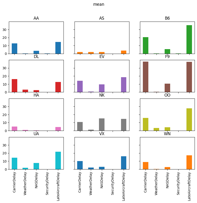
def mean_delay_plot(df, freq, figsize=(10, 8)):
    """
    Make a bar chart of average flight delays for each carrier at
    a given frequency.
    """
    mean_delays = (
        df
        .groupby([pd.Grouper(key="Date", freq=freq), "Carrier"])
        ["ArrDelay"]               # extract one column
        .mean()                    # take average
        .unstack(level="Carrier")  # Flip carrier up as column names
    )

    # plot
    axs = mean_delays.plot.bar(
        figsize=figsize, subplots=True, legend=False, sharex=True,
        sharey=True, layout=(4, 3), grid=False
    )

    # tweak spacing between subplots and x-axis labels
    axs[0, 0].get_figure().tight_layout()
    for ax in axs[-1, :]:
        ax.set_xticklabels(mean_delays.index.strftime("%a, %b. %d'"))

    # return the axes in case we want to further tweak the plot outside the function
    return axs


def delay_type_plot(df, start, end):
    """
    Make bar charts for total minutes, average minutes, and number of
    occurrences for each delay type, for all flights that were scheduled
    between `start` date and `end` date
    """
    sub_df = df.loc[
        (df["Date"] >= start) & (df["Date"] <= end)
    ]

    def positive(df):
        return (df > 0).sum()

    aggs = sub_df.groupby("Carrier")[delay_cols].agg(["sum", "mean", positive])

    reshaped = aggs.stack().T.swaplevel(axis=1).sort_index(axis=1)

    for agg in ["mean", "sum", "positive"]:
        axs = reshaped[agg].plot(
            kind="bar", subplots=True, layout=(4, 3), figsize=(10, 8), legend=False,
            sharex=True, sharey=True
        )
        fig = axs[0, 0].get_figure()
        fig.suptitle(agg)
#         fig.tight_layout();
Exercise
See exercise 5 in the exercise list.
Now let’s look at that plot at a daily frequency. (Note that we need the figure to be a bit wider in order to see the dates.)
mean_delay_plot(air_dec, "D", figsize=(16, 8));
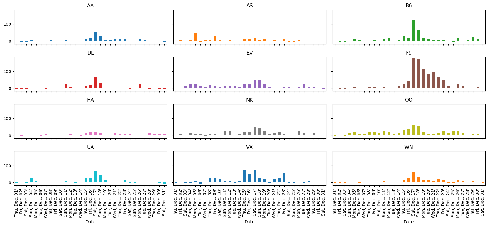
As we expected given our analysis above, the longest average delays seemed to happen in the third week.
In particular, it looks like December 17th and 18th had — on average — higher delays than other days in December.
Let’s use the delay_type_plot function to determine the cause of the
delays on those two days.
Because our analysis is captured in a single function, we can look at the days together and separately without much effort.
# both days
delay_type_plot(air_dec, "12-17-16", "12-18-16")
/tmp/ipykernel_3049/3865096838.py:44: FutureWarning: The previous implementation of stack is deprecated and will be removed in a future version of pandas. See the What's New notes for pandas 2.1.0 for details. Specify future_stack=True to adopt the new implementation and silence this warning.
  reshaped = aggs.stack().T.swaplevel(axis=1).sort_index(axis=1)
# only the 17th
delay_type_plot(air_dec, "12-17-16", "12-17-16")
/tmp/ipykernel_3049/3865096838.py:44: FutureWarning: The previous implementation of stack is deprecated and will be removed in a future version of pandas. See the What's New notes for pandas 2.1.0 for details. Specify future_stack=True to adopt the new implementation and silence this warning.
  reshaped = aggs.stack().T.swaplevel(axis=1).sort_index(axis=1)
# only the 18th
delay_type_plot(air_dec, "12-18-16", "12-18-16")
/tmp/ipykernel_3049/3865096838.py:44: FutureWarning: The previous implementation of stack is deprecated and will be removed in a future version of pandas. See the What's New notes for pandas 2.1.0 for details. Specify future_stack=True to adopt the new implementation and silence this warning.
  reshaped = aggs.stack().T.swaplevel(axis=1).sort_index(axis=1)
The purpose of this exercise was to drive home the ability to automate tasks.
We were able to write a pair of functions that allows us to easily
repeat the exact same analysis on different subsets of the data, or
different datasets entirely (e.g. we could do the same analysis on
November 2016 data, with two lines of code).
These principles can be applied in many settings.
Keep that in mind as we work through the rest of the materials.
Exercise: Cohort Analysis using Shopify Data#
The code below will employ a fairly large simulated data set that has the properties of a order-detail report from Shopify.
We’ll first look at the data, and then describe the exercise
# Set the "randomness" seeds
random.seed(42)
np.random.seed(42)

url = "https://datascience.quantecon.org/assets/data/shopify_orders.csv.zip"
orders = pd.read_csv(url)
orders.info()

orders.head()
<class 'pandas.core.frame.DataFrame'>
RangeIndex: 715449 entries, 0 to 715448
Data columns (total 15 columns):
 #   Column             Non-Null Count   Dtype
---  ------             --------------   -----
 0   Unnamed: 0         715449 non-null  int64
 1   Day                715449 non-null  object
 2   customer_type      715449 non-null  object
 3   Customer ID        715449 non-null  int64
 4   orders             715449 non-null  int64
 5   total_sales        715449 non-null  float64
 6   Returns            715449 non-null  float64
 7   Ordered quantity   715449 non-null  int64
 8   Gross sales        715449 non-null  float64
 9   Net sales          715449 non-null  float64
 10  Shipping           715449 non-null  float64
 11  Tax                715449 non-null  float64
 12  Net quantity       715449 non-null  int64
 13  Returned quantity  715449 non-null  int64
 14  Discounts          715449 non-null  float64
dtypes: float64(7), int64(6), object(2)
memory usage: 81.9+ MB
| Unnamed: 0 | Day | customer_type | Customer ID | orders | total_sales | Returns | Ordered quantity | Gross sales | Net sales | Shipping | Tax | Net quantity | Returned quantity | Discounts | |
|---|---|---|---|---|---|---|---|---|---|---|---|---|---|---|---|
| 0 | 0 | 2019-06-17 | Returning | 6535260 | 1 | 41.03 | -0.0 | 1 | 41.03 | 41.03 | 0.00 | 0.0 | 1 | 0 | -0.0 |
| 1 | 1 | 2015-01-31 | First-time | 4283889 | 1 | 37.96 | -0.0 | 2 | 37.96 | 37.96 | 0.00 | 0.0 | 2 | 0 | -0.0 |
| 2 | 2 | 2017-09-14 | Returning | 5270434 | 1 | -25.40 | -30.5 | 0 | 0.00 | -30.50 | 5.09 | 0.0 | 2 | 2 | -0.0 |
| 3 | 3 | 2017-10-29 | Returning | 4836086 | 1 | 12.70 | -0.0 | 4 | 12.70 | 12.70 | 0.00 | 0.0 | 4 | 0 | -0.0 |
| 4 | 4 | 2016-10-01 | Returning | 9541330 | 1 | 216.58 | -0.0 | 3 | 208.59 | 208.59 | 7.99 | 0.0 | 3 | 0 | -0.0 |
We define a customer’s cohort as the month in which a customer placed their first order and the customer type as an indicator of whether this was their first order or a returning order.
We now describe the want for the exercise, which we ask you to complete.
Want: Compute the monthly total number of orders, total sales, and total quantity separated by customer cohort and customer type.
Read that carefully one more time…
Extended Exercise#
Using the reshape and groupby tools you have learned, apply the want
operator described above.
See below for advice on how to proceed.
When you are finished, you should have something that looks like this:
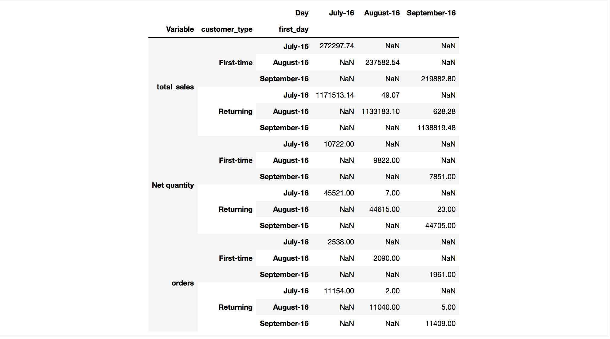
Two notes on the table above:
Your actual output will be much bigger. This is just to give you an : idea of what it might look like.
The numbers you produce should actually be the same as what are : included in this table… Index into your answer and compare what you have with this table to verify your progress.
Now, how to do it?
There is more than one way to code this, but here are some suggested steps.
Convert the
Daycolumn to have adatetimedtypeinstead of object.Hint
Use the
pd.to_datetimefunction.
Add a new column that specifies the date associated with each customer’s
"First-time"order.Hint
You can do this with a combination of
groupbyandjoin.Hint
customer_typeis always one ofReturningandFirst-time.Hint
Some customers don’t have a
customer_type == "First-time"entry. You will need to set the value for these users to some date that precedes the dates in the sample. After adding valid data back intoordersDataFrame, you can identify which customers don’t have a"First-Time"entry by checking for missing data in the new column.
You’ll need to group by 3 things.
You can apply one of the built-in aggregation functions to the GroupBy.
After doing the aggregation, you’ll need to use your reshaping skills to move things to the right place in rows and columns.
Good luck!
Exercises#
Exercise 1#
Look closely at the output of the cells below.
How did pandas compute the sum of gbA? What happened to the NaN
entries in column C?
Write your thoughts.
Hint
Try gbA.count() or gbA.mean() if you can’t decide what
happened to the NaN.
df
gbA.sum()
Exercise 2#
Use introspection (tab completion) to see what other aggregations are defined for GroupBy objects.
Pick three and evaluate them in the cells below.
Does the output of each of these commands have the same features as the
output of gbA.sum() from above? If not, what is different?
# method 1
# method 2
# method 3
Exercise 3#
Note
This exercise has a few steps:
Write a function that, given a DataFrame, computes each entry’s deviation from the mean of its column.
Apply the function to
gbA.With your neighbor describe what the index and and columns are? Where are the group keys (the
Acolumn)?Determine the correct way to add these results back into
dfas new columns.Hint
Remember the merge lecture.
# write function here


# apply function here
# add output of function as new columns to df here...
Note that if the group keys remained in the index as the .apply’s output, the merge/join step would have been complicated.
Exercise 4#
Think about what is shown in the the plots above.
Answer questions like:
Which type of delay was the most common?
Which one caused the largest average delay?
Does that vary by airline?
Write your thoughts.
# your code here if needed
Exercise 5#
Verify that we wrote the functions properly by setting the arguments to appropriate values to replicate the plots from above.
# call mean_delay_plot here
# call delay_type_plot here